Parke County Covered Bridge

While I’m in watercolor mode, here’s another.  This one is from a photo I took out in Parke County Indiana, the covered bridge capitol of the world. We were there in late October when there was very little foliage left on the trees.

Those of you who subscribe to Bound and Lettered might remember seeing it there in an article I wrote about using masking fluids.  The white portions of the bridge, the rocks and some of the larger areas of white on the trees were masked. After it was removed from the bridge, the grey tones and lettering were added.


Clicking on the graphic it will open a larger copy in a new window where you can see more detail. The rocks and under the bridge have a slightly shiny take to them where I used brushed gum arabic to create a wet look. The white areas of the trees are sgraffito.  I removed the color with a fritch scrub brush and an exacto knife.

Watercolor Inspiration

I enjoy painting with watercolor.  The transparency allows for color mixing and blending unlike either oils or acrylics.  I try to have a camera handy when we travel and keep a digital file of reference photos.

This watercolor is loosely based on a photograph of a bridge in the Blue Ridge mountains near Roaring Gap, NC.  The aging stonework offered such an array of earthtones balanced against the trees and sky.

Click on the thumbnail for more detail.


Acrylic Mediums

 Back to the studio.  This week I’ve been working with acrylic mediums.  For those who aren’t familiar with acrylics, the various gels, pastes and liquid mediums allow for shapes and color to be applied in various glazes and textures. This also allows for lettering on and between layers.  For more detail click on the thumbnail.

This is a 16×16 canvas collaged with unpainted double shuen.  It was then covered with a layer of white wash so that when it was dry I could use water media to write and also to allow me to impress letters into the surface.  If you look closely at the detail below you’ll see small block letters rising like bubbles from the sea.

There are more collaged papers giving the illusion of fish. The raised “seaweed” was created with gesso thinned with matte medium applied with a squeeze bottle. The illusion of sand was created with mica gels. The various layers of color are acrylic glazes.  I’ve posted the work here before any lettering is applied so that you can see the underlying structure more easily.


Keeping a Sketchbook

I began keeping loose-leaf notebooks some thirty years ago when I attended classes and workshops.  In the beginning they included not much more than some exemplars and practice lettering sheets.  When I found I was becoming a pack rat, I realized that it made more sense to place the exemplars in clear sheet protectors and keep only those bits and pieces that I knew I might revisit when the creative muses were on vacation.

Later, as I added classes in life drawing, watercolor and pastel, I switched to spiral bound sketchbooks.  I still use notebooks for exemplars, but now I use the sketchbooks to take notes, cut and paste small examples from workshops, and to experiment with design, color and tools.  They have become an invaluable reference.

Quick Tip for Chapped Hands

If you’re like me you spend a lot of time with your hands in water.  Whether rinsing out brushes, sponges and rollers or using various wet techniques to wash backgrounds.  The combination of water and dry winter air can make for some pretty rough skin; what the commercials of the 1950’s called “dishpan hands”. In the spring, I’m also an obsessive gardener and the wet dirt isn’t much easier on the hands.  It seems like no amount of hand lotion helps. One thing that has helped my hands over the years is a product called “Bag Balm”.  Designed in the 1890’s to heal cracked udders on milking cows, it soon found its way into the kitchen and a host of other places.  I haven’t the foggiest idea how it works, but it does and that small green can will last forever.

Winter Inspiration

The creative spark has been in full gear this past week.  Between shoveling snow and being invited to participate in the Washington Calligraphers Guild Invitational Exhibit, I’m afraid I haven’t been posting as often as I’d like.  I’ve been having great fun preparing a new piece to send off this month to DC.  Meanwhile, photographing art for the gallery here is temporarily on hold, but I couldn’t resist taking some photos of last night’s beautiful snowfall.

Announced by all the trumpets of the sky, Arrives the snow, and, driving o’er the fields, Seems nowhere to alight: the whited air hides hills and woods, the river, and the heaven, and veils the farmhouse at the garden’s end. The sled and traveller stopped, the courier’s feet delayed, all friends shut out, the housemates sit around the radiant fireplace, enclosed in a tumultuous privacy of storm.     

Ralph Waldo Emerson

Out of the bosom of the Air, out of the cloud-folds of her garments shaken, over the woodlands brown and bare, over the harvest-fields forsaken, silent, and soft, and slow descends the snow.

Henry Wadsworth Longfellow


Something New

Just having fun with the alphabet, here’s a 10×24 canvas covered in double shuen, multiple layers of collage, text and pastel. Using watercolor, walnut and sumi inks, graphite and Dr. Martin’s Bleedproof white, and a bit of gold dust, there’s lots going on. You might even spot some life drawing if you look closely.


Click on thumbnail for complete image.

Work In Progress

This 24×30 gallery wrapped deep canvas piece that’s still in the works. The photo probably doesn’t do the detail justice. I began by covering the entire surface with double shuen paper using rice paste. That was followed with walnut and sumi ink spritzed and brushed on; then a coating of 50/50 matte medium. Still not satisfied with the surface, I then pasted more shuen papers that have been rolled with black relief paints. On top of that are acylics both brushed and rolled.  It still isn’t finished as I’m experimenting with text and color to add yet another dimension.  I enjoy the process of slowly building up the design gradually until it has a satisfying balance of both texture and color.


Click on the thumbnail for more detail.


Walnut, Sumi and Gold.

I love to make backgrounds.  I know people who enjoy the paste paper process, others who enjoy suminagashi.  I like watercolor paper, sumi and walnut inks with a bit of Schminke or laid gold thrown in for fun.  I work wet-in-wet on half sheets of watercolor paper that I can later cut down. I like the wet technique because half the fun are those wonderful surprises you find when the paper dries.  Here are a few to whet your appetite for something simple.


Why Use Good Materials?

When I first began as a calligrapher in the 1970’s, my entire studio consisted of a drawing table, slant board, duplicator (nowadays copier) paper, Osmiroid pen, Pelikan 4001 ink, rulers and pencils.  For nice work, we used bristol board. A lot of my work involved paste-ups, rubylith film and professional copying for publication.  Other things like envelope addressing and filling in certificates were standard fare. I have to admit that I never gave a thought to the ink fading or the paper disintegrating.

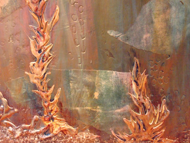
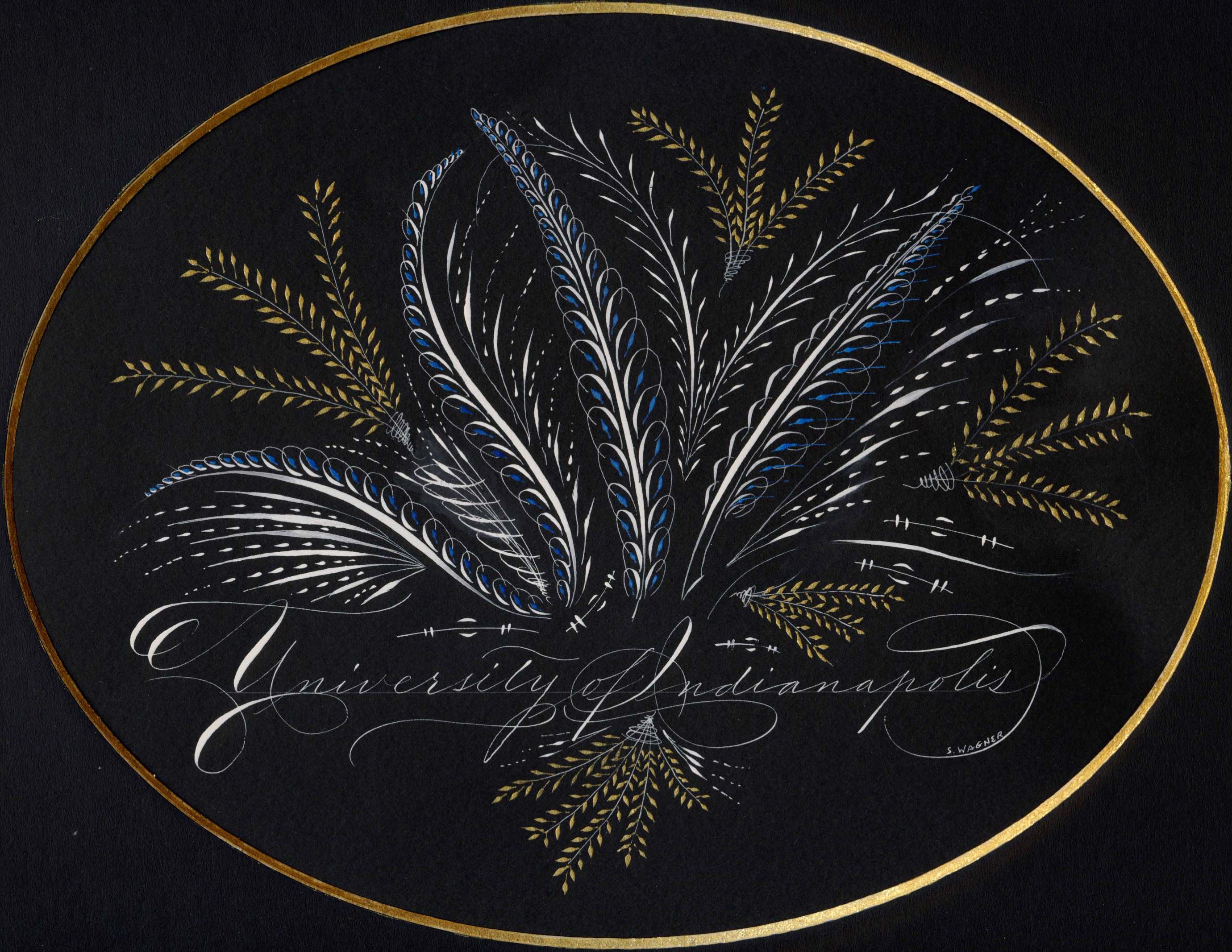
Now years later and a whole lot wiser, I know that it should be one of the first things one considers.  Take a look at the piece below.  It’s Dr. Martin’s Bleedproof White, Daniel Smith Iridescent Watercolors and Canford Black Paper. Click on the thumbnail and look a bit closer.  See that slightly lighter black oval? That’s the place where the matte covered the black paper while it was framed.  The piece was on display for less than a month and never in direct sunlight.  Wouldn’t you feel badly if you sold this to someone and a year or so down the road the black paper simply faded away?

Canford is a beautiful shade of black and wonderful to write on.  But it, along with MiTientes fades in the sun and fairly quickly as you can see.  Not a big deal if you’re practicing or jotting off a quick greeting card. But not for a piece you spend hours on and one that you’d like to last.  And it’s not just paper than can cause problems.  Ink and paint can also fade or change color with time.  Reds are notorious for turning this ugly shade of brown.  And some ink, like oak gall, can actually eat away at your paper.  Our local historical society is currently in a race against time to preserve documents written in the 18th and 19th centuries where the ink is literally eating holes in the paper.

How do you know then what to use?  Paper should be acid-free. Paper designed for printmaking and watercolors from good mills such as Arches, BFK, Fabriano, etc. may be a bit more pricey, but it won’t deteriorate with time.   If you’re in doubt about a dyed paper, take a small strip, cover half with a piece of cardboard and hang it in a southern window for a month or so.  Like the Canford above, the exposed portion will fade in the sun.

What you paint and write with is as important as the support.  Acidic inks such as oak gall will eventually rot the paper underneath. Ink in markers or designed for fountain pens are usually dye based rather than pigment and often will fade or change color.  So if you haven’t learned to load a dip pen with a brush, now’s a good time.  You’ll have a whole new range of materials available to you such as watercolor, gouache, acrylics and caseine.

Buying pigment based materials isn’t without its pitfalls.  There is good information available online, or in books such as Hillary Page’s or Michael Wilcox’s watercolor books, about pigments are stable and those that are considered “fugitive”.  A good rule of thumb is that if the label doesn’t list the pigments, you probably don’t want to buy it.  For instance, alizaron crimson is a fugitive red.  Its color will shift with time to a rather dull brownish red, either alone or mixed with other colors.

Lastly, it always pays to purchase quality art materials.  Artist quality paint will cost a bit more, but in the long run because they have more pigment and less filler, will give you a better result.  Meanwhile use up that inexpensive paper, markers and dye based inks for practice or give them to the grand-kids to play. Who knows you may have another budding artist in the making.