Soft Winds

Sumi ink and watercolor evoke a feeling of soft winds across a sea of azure. The letters are gleaned from the earliest known examples of written Greek discovered in 1900 on Crete by the archeologist Sir Arthur Evans and have been used only for their artistic value without any meaning implied.


Be Aware of Wonder!

Using wet in wet techniques, Nussbaumbieze (peat ink), Moon Palace sumi, Dr. Martin’s Bleedproof White and Daniel Smith watercolor were painted, rolled or dropped onto Arches Velin paper thereby creating a feeling of joyous chaos and wonder, eventually inspiring the text fragment Be Aware of Wonder to be written gesturally on the final 7.5″ x 9.5″ fragment cut from the original sheet.

Where Is Art?

Selected for the 2010 Letter Arts Review Annual Juried Issue, the text is original and was gesturally written in response to the background created with a pen/ink sgraffito technique and watercolor wash on 8×10 Rives BFK. The French shell gold was added as an accent.

Where is Art?
The art is in the eyes and art
is in the mind.
Open the mind so that your eyes might see what your heart knows!
For therein lies art.

Darkness Into Light

The underlying watercolor wash was created over a blindly written text using a wax pencil resist. A feeling of the illusiveness of creativity lying in wait within the darkness of one’s mind brought to me the following text fragment – Reaching through the darkness to find the light – subsequently layered as a text block using white gouache.

Back in the Saddle Again

I have been remiss in posting the past few weeks.  I won’t bore you with all the details except to say that it involved both a marvelous week with our granddaughter Alex and spending some time gathering photographs and typing information for entries to LAR.  I’m still knee deep in engraving, but taking time in both the studio and the garden is good for the soul.  Here are a few things I’ve been working on.

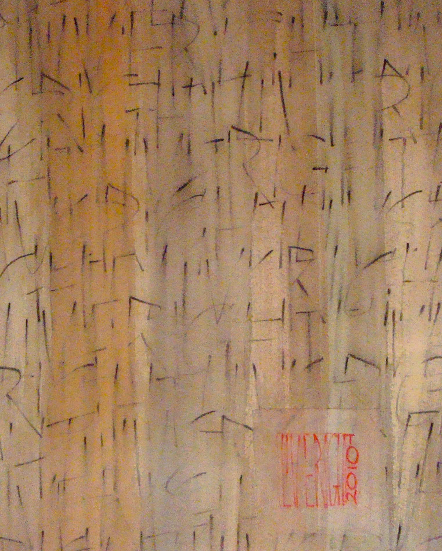
I’ve been experimenting with water-soluble pencils, including the
Derwent graphite and watercolor.  The result is intriguing and has lots of possibilities.

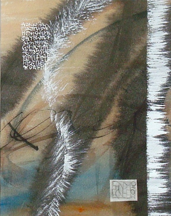
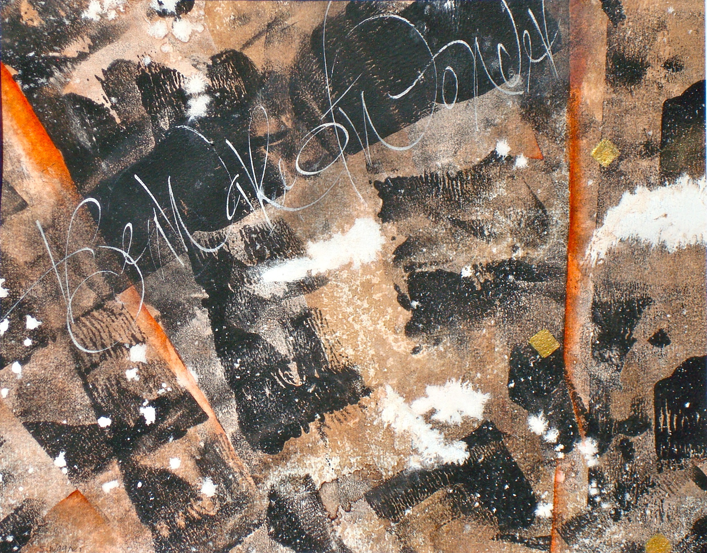
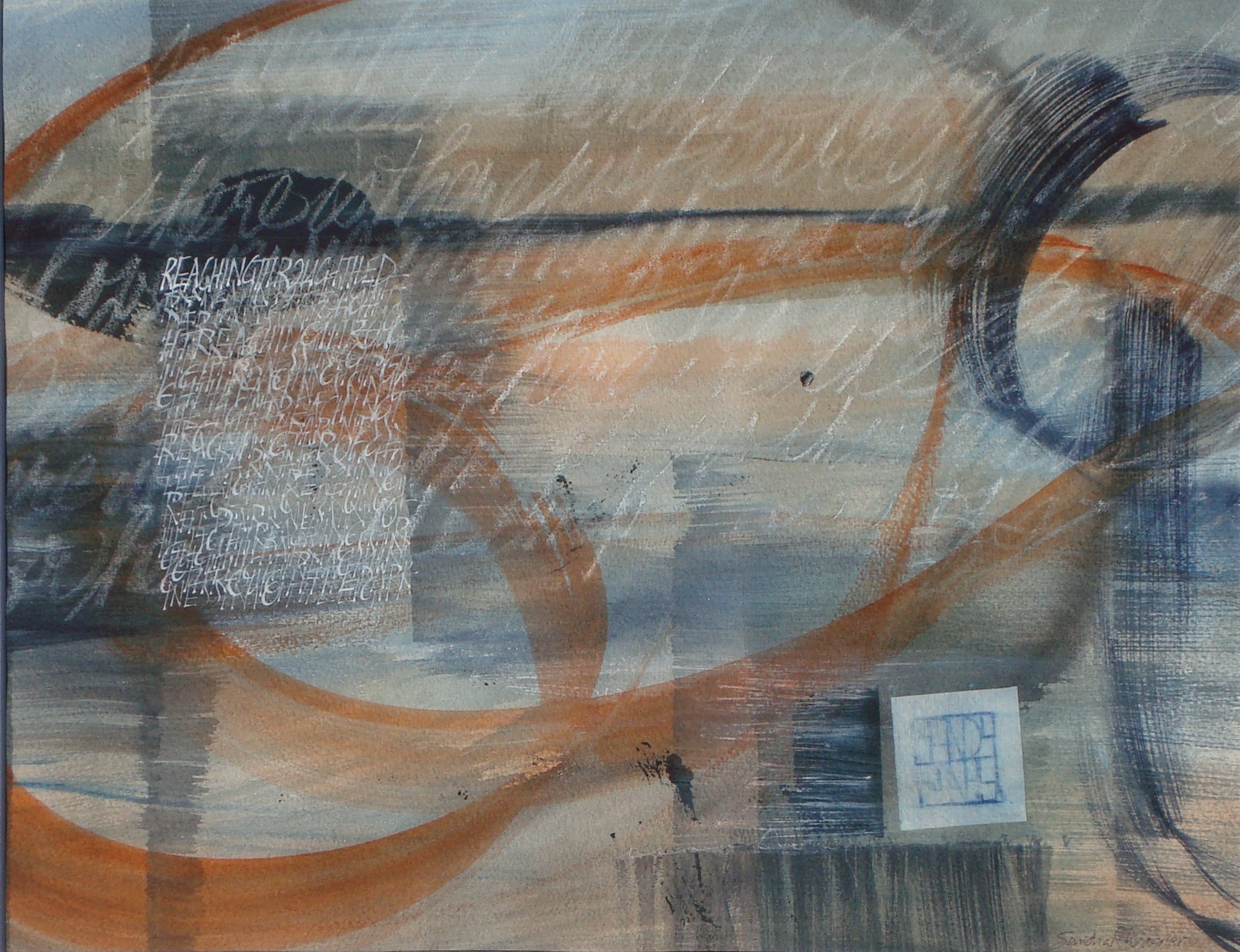
Using blind writing as a resist, watercolors with only one or two pigments, and letter shapes as background give this a depth that’s hard to achieve with a paste paper background. I work in layers allowing one to dry before adding the next.  I love Daniel Smith paints and use them almost exclusively now. I like that you can buy watercolors, acrylics and printmaking inks all in the same color ranges.  The piece to the right uses wax pencil, watercolor and gouache on Arches text wove.

BTW, here’s a little studio tip I gleaned from friends at Cheerio – add a bit of Dr. Martin’s Bleedproof White to your white gouache (I usually use W&N permanent white) and it will pop out better on that background.  I also always decant my whites into a second container, even though I try to reserve a few nibs just for white, you never know when your pen might have a bit of color left in it; no point in ruining a whole bottle of Dr. Martin’s with a random bit of gouache or watercolor.

And lastly, if you’re looking for some end of summer reading material, you might check out Free Play, Inspiration in Life and Art by Stephen Nachmanovitch.  It won’t make practicing those letter forms any easier, but you’ll find lots of reasons to play while you practice.  You can never tell when one of those “happy accidents” might grace your page.


Parke County Covered Bridge

While I’m in watercolor mode, here’s another.  This one is from a photo I took out in Parke County Indiana, the covered bridge capitol of the world. We were there in late October when there was very little foliage left on the trees.

Those of you who subscribe to Bound and Lettered might remember seeing it there in an article I wrote about using masking fluids.  The white portions of the bridge, the rocks and some of the larger areas of white on the trees were masked. After it was removed from the bridge, the grey tones and lettering were added.


Clicking on the graphic it will open a larger copy in a new window where you can see more detail. The rocks and under the bridge have a slightly shiny take to them where I used brushed gum arabic to create a wet look. The white areas of the trees are sgraffito.  I removed the color with a fritch scrub brush and an exacto knife.

Watercolor Inspiration

I enjoy painting with watercolor.  The transparency allows for color mixing and blending unlike either oils or acrylics.  I try to have a camera handy when we travel and keep a digital file of reference photos.

This watercolor is loosely based on a photograph of a bridge in the Blue Ridge mountains near Roaring Gap, NC.  The aging stonework offered such an array of earthtones balanced against the trees and sky.

Click on the thumbnail for more detail.


Walnut, Sumi and Gold.

I love to make backgrounds.  I know people who enjoy the paste paper process, others who enjoy suminagashi.  I like watercolor paper, sumi and walnut inks with a bit of Schminke or laid gold thrown in for fun.  I work wet-in-wet on half sheets of watercolor paper that I can later cut down. I like the wet technique because half the fun are those wonderful surprises you find when the paper dries.  Here are a few to whet your appetite for something simple.