Dominus Vobiscum (detail)

Exhibited in the 2010 Washington Calligraphers Guild Juried Exhibition, Dominus Vobiscum incorporates acrylic, gouache and sumi lettering done after painted double shuen paper has been collaged onto a 16×16″ gallery wrapped canvas.

Those Marvelous Margins

I don’t think one can say this too many times.  Margins are important, perhaps the most important part of a work.  They are the frame within the frame; a place for the eye to rest while soaking up the artwork or letters contained within.


So why do so many contemporary calligraphers and book artists neglect these wondrous white (or background) spaces?

Here are two photos of same blackletter page.  One has had the margins cropped off.  The original has breathing room.  It allows you to appreciate the texture of the lettering, to notice the darks and lights of the majuscules and to focus on whole words and sentences.  The other should, even if you’ve never studied layout and design, make you slightly claustrophobic.

Manuscript page design has changed little since the first books were written.  Whether you’re looking at a page from the Book of Kells  or browsing the Saint Johns Bible Website, you will see margins that enhance the readability and artistic design of the page. Two very fine resources for studying traditional margins are The Calligraphers Handbook, edited by Heather Child (the paperback with the blue cover) and Edward Johnston’s Writing and Illuminating and Lettering.

But what if you’re not designing a page in a book? What about contemporary art, addressing envelopes, or making a broadside?  Space still matters.

For more contemporary studies, Sheila Water’s Foundations of Calligraphy and Annie Cicale’s The Art & Craft of Hand Lettering both contain chapters devoted to layout and design.

 Studying good calligraphic art is also a very good way to educate your eye.  But as you dissect and study letter forms, don’t forget to look for what isn’t there, those magical places above, below, around and between. Margins, interlinear space, anywhere the lettering is NOT is equally as important as the finest letters you can create.

A week with Sheila and Julian


I spent the first week of May at Cheerio with twenty six wonderful students and master calligraphic artists, Sheila and Julian Waters.  Mother and son comprise a teaching duo that sometimes contradict, but always complement each other’s work.  If you’ve been involved in studying the calligraphic arts for any amount of time, you surely have come to know both their works.

Originally designed as two half week classes, the classes were combined into one large group.  Sheila’s component involved designing a traditional manuscript book from inspiration to execution.  Julian’s involved writing with large instruments such as ruling pen, cola pens, coit or automatic pens, etc.   It might not seem that those two topics would blend together in one workshop, but the duo of Waters and Waters made it happen in a fluid and seamless way.


Their use of digital media as a method of instruction was amazing.  For the first time in any workshop I’d ever attended, we could sit at our seats, watch all the demonstrations and simultaneously write and take notes.  It was amazing.  Something so mundane as pen angle could be viewed in detail unavailable if we were to all stand around a demonstration table and we could try it at the same time.


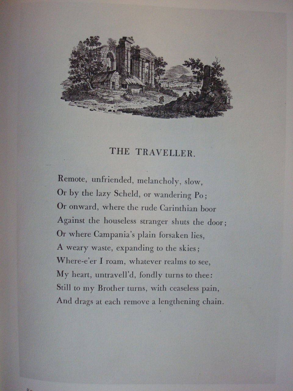
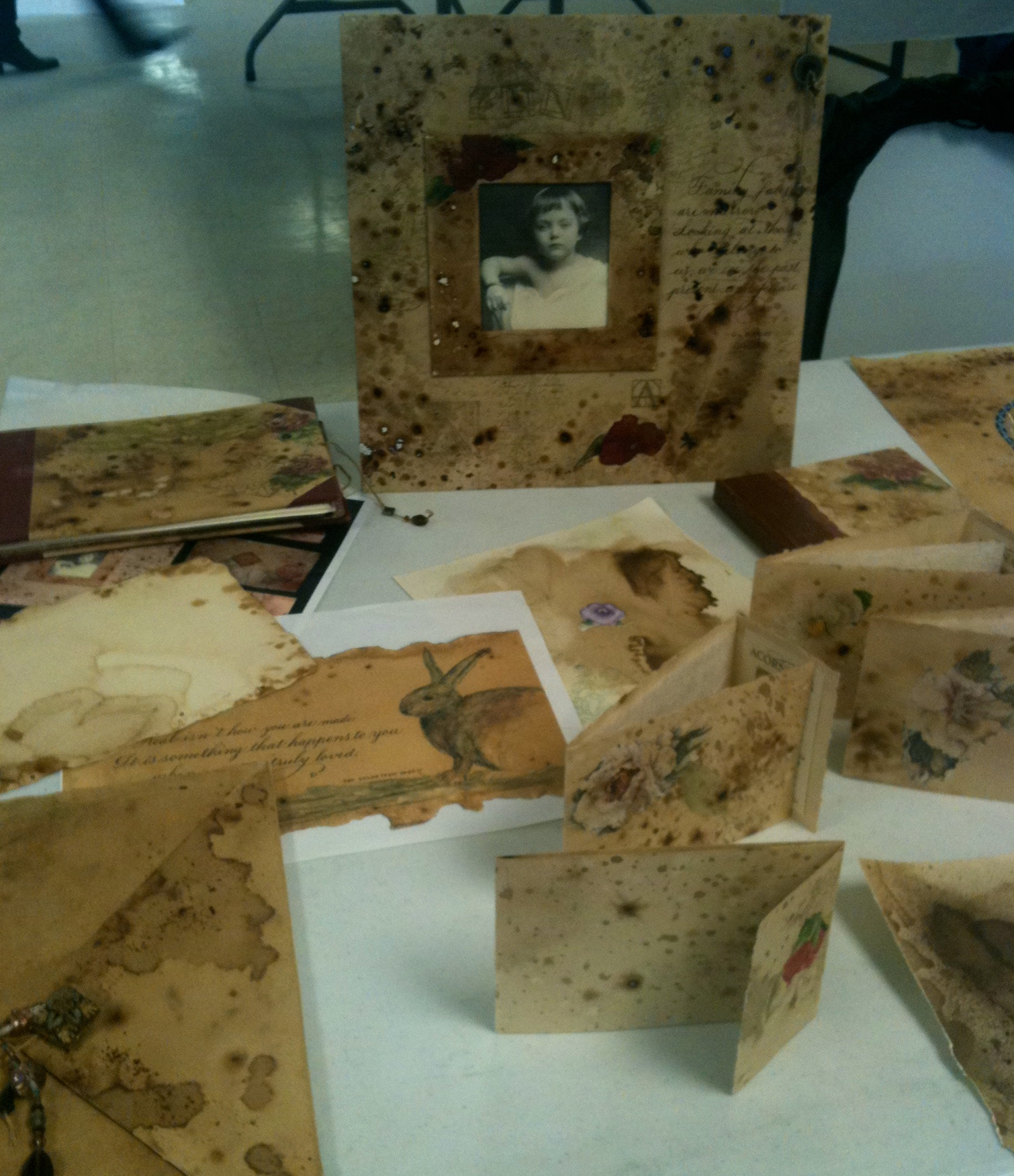
From the beginning our focus would include the rich history of manuscript design.  With the use of the camera, Sheila was able to show us actual manuscript pages, zooming in so that we could see the tiniest detail.  Most amazing of all was that from the earliest pages of the Book of Kells to current manuscript design, margins and page layout is timeless.  Traditional margins and layout were just as relevent now as in the tenth century.

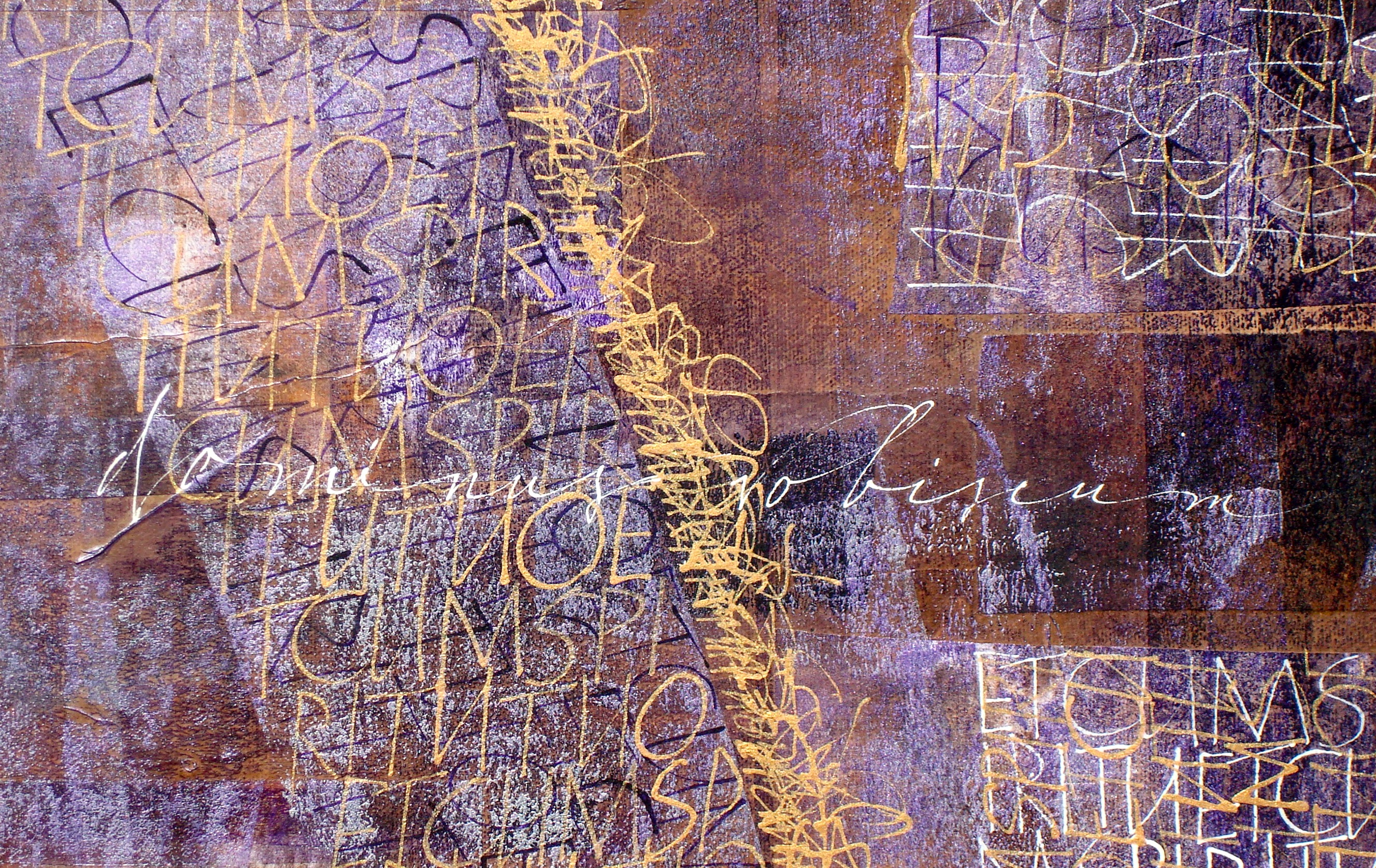
Interspersed with choosing our words and script, designing our layout, learning the ins and outs of paper cutting and book design, Julian created a fun atmosphere of ruling pen work.  In addition to learning to write with the pens, we looked at the many varied ways of using the non-traditional tools.  Just something as simple as changing the weight with the letters could create a completely different look to your page.  Our layout options were definitely increasing exponentially.

As the week progressed, we were able to present our work for a sort of semi-public critique.  Rather than the usual one on one, table to table individual help, we placed, at first with some trepidation, our work under the camera.  What a wonderful surprise for all of us.  No matter what our level of expertise, Sheila and Julian found positive elements along with inspiration to improve.  We all learned from twenty-six individuals and two master teachers.

Cheerio is an amazing place.  You meet and make great friends.  You can work anytime of day or night and the atmosphere of the mountains is guaranteed to put you in a creative mood.  In addition to the instruction from fabulous mentors, we also learn from each other.  Helen, Annie and Takako demonstrated Ranger Inks as we made small mock-up books to sew and Helen took an evening to help us learn suminagashi.

And I would be completely remiss if I didn’t add a bit about the food.  Martyn is an amazing chef.  From things like apricot glazed pork to all the salad choices to desserts that are to die for, he makes our week of artistic wonder a culinary delight.

I could write pages about my amazing weeks in the North Carolina mountains.  Joyce and Jim Teta along with John Stevens, Martyn Armstrong and the folks at Camp Cheerio as well as a host of amazing instructors and students have teamed up for the past thirty years to make this one of the most amazing artistic experiences a calligrapher or book artist can attend.  It’s truly a “calligraphic heaven on earth”.


Fun with ink and water

It’s no secret that  I love using water techniques. I love the spontaneity and the often surprising results. I’ve been experimenting with suminagashi the last week or so.  Although similar to more modern marbling techniques, it is a very old technique, and has the benefit of needing only water and ink rather than all the preparation for oil based marbling.  For me, I like the informality, the more delicate colors and textures along with the less structured forms.

I’m fortunate to have a very large (and very old) concrete double washtub in a basement laundry room.  Couple that with our daughter’s left behind dark room materials and I have a made to order suminagashi playground.

The trays are made for photo developing and come in myriad sizes. These are large enough to accomodate an eighth sheet of Arches velin. I elevated them to a more workable height using plastic storage milk crates.  Definitely saves your back.  One tray is for the ink and the other for rinsing.

You can purchase sets of suminagashi inks from art supply catalogs.  They work well, but I’m not particularly fond of the colors. They’re very bright, but they blend well and with a little mixing you can get some lovely browns and greys.  You can also experiment with acrylics for a more water resistant design.

For black, I use ordinary bottled sumi inks.  The brushes are inexpensive Chinese hair.  The most important ingredient is either Ox Gall or  PhotoFlo.  The latter one can get it from photographic dark room suppliers.   Add a drop or two to each color and to your clear water.  It makes the ink float on the surface rather than sink.  Go easy, you can always add another drop or two if the colors are sinking.


Loading one brush with clear water and the other with ink, alternate lightly touching the water. Traditionally it’s done in concentric rings and you can find several Youtube videos to see the technique.  But there are many ways to create shapes floating on the water.

Experiment with touching the water in different places, alternating clear with sumi, lightly brushing or fanning the water or blowing on the surface gently.  When you think you have a design you like, hold the paper with a slight bend in the center (so it touches the water first) and lay the paper gently on the surface.  You can ink only one side, flip the paper over, or submerge it to allow the ink to flow over the top of the paper.  The more you disturb the ink, the more spontaneous the designs.  Rinse them gently to remove the excess ink.

I hang them on a clothes line to drip dry. It’s not necessary but I then place them between blotting paper and into a paper press to completely flatten and dry. The rest is up to your own imagination.  End papers, covering book boards, backgrounds for lettering, the possibilities are endless.  The patterns are so lovely, you may find them attractive all on their own.  Enjoy!

Workshop remnants

In the previous post, I added that I’d cut my workshop papers to fit into a coptic bound sketchbook similar to the ones I’d made before.


The papers are interspersed with plain sheets of Arches text.


There are seven signatures and just for fun, I included beads in the sewing. As in the other books, I will used this one for sketching, adding lettering, collage elements, etc. wherever the papers lead me.

After the party’s over.

This past weekend our guild hosted a marvelous workshop with Harvest Crittenden.  There was much playing with walnut, coffee and other natural dyes.  We experimented with bleach, salt, mica powders and even watercolor crayons. There were techniques for transferring laser copies of photographs with acrylic mediums, blender markers and contact paper. We made coffee clay ornaments and tried out various rubber stamping techniques. The final focus would be to create an antiqued square paper adhered to binder’s board with a smaller frame, similar to the one to the rear of the photo here.

It was great fun, but the real challenge is coming back home and finding out how to incorporate these techniques into one’s own work without becoming what I like to call a “workshop clone”.  We’ve all been there.  It’s so tempting to repeat what you’ve learned and suddenly you have a studio full of paste papers or fancy curlycue doo-dads.

That doesn’t mean you can’t make a frame and background.  Here’s mine, which while unfinished, gave me a chance to try using acrylic pouring medium to transfer the photo here at home.  It resulted in an interesting puddle of acrylic rather than the smooth flat acrylic skin you get when you brush on multiple coats of gel.  Since it comes in only gloss finish, I added a coat of matte medium over the finished skin to take down the glare.  Although I may never finish this project, the experimentation was great.


The ultimate goal in any workshop should be to take what works for you and see how you can use it in your own work. The paper we used was Arches text wove.  I cut my experimental workshop pages in a 5 x 14 inch size so that I can include them in another of my coptic bound sketch books.


The photo to the left is a detail of one of the sketchbook sized pages where the paper has been bruised with a ruling pen, covered with coffee stain, walnut ink and instant coffee granuals.  The transfer was done with contact paper, but I didn’t like the plastic look.  When I peeled it off, it left a wonderful shadow.  Happy accidents are always welcome.


To the right is a page from one of my current sketch books where I tried transferring a photo with the chartpak blender pens.  I highly recommend these as an alternative to the very messy and smelly acetone transfer technique that some books suggest.

Another experiment involved using matte medium and artwork from cocktail napkins.  This is lots of fun and the results were lovely, but probably not something I’d use in my original artwork since there could be copyright issues involved in using the artwork on the napkins.


All in all, it was a great weekend.  Harvest is a master teacher and her techniques are all applicable to artwork from antique to modern.  I enjoyed every minute and could spend hours experimenting and creating here in my studio.


What inspires you?

As an artist, one gets asked a lot about where the ideas come from, why did you do this, or what made you think of that.  The simple answer is that there is no simple answer.  For me, it’s about color, shape and line, the feel of the brush on the paper or canvas, the shape of the text.

When you look at the shadows on the snow, what do you see?  The myriad colors of blues and grey?  The textures of the branches?  Or do you simply feel the cold winter air? Each of us visualizes differently.  There is no one right way to make art.


As an artist who uses letters, occasionally I begin work with a text, but more often the text seems to flow directly from the colors and shapes on the page. Personally I find that this can make all the difference between writing words on a page and text that becomes a part of the art.

Our western tradition of illustration is one that often separates the art from the text.  Books often have authors and illustrators.  But what if the text is the art?  What then?

The computer age has forced us to rethink the place of calligraphy in our lives. This is hardly a new concept.  Handwritten letters as a means of communication has been becoming redundant since Gutenberg’s moveable type.


But that doesn’t mean letters aren’t important. Brody Neuenschwander’s translation of Hans-Joachim Burgert’s writing, The Calligraphic Line is a wonderful introduction to viewing letters in the context of graphic forms.

In answer to the original question, where does a lettering artist derive inspiration, the answer lies from within.  So instead of sitting around waiting for that perfect quotation, just pick up your pen or brush and begin.  Let the letters inspire.


Facebook, love it or hate it?

I just finished creating a Facebook page for our local guild Calligraphy Guild of Indiana.  In just the two days since we’ve been online, there have been posts from around the world and whether we like it or not, social media is here to stay.  Like its predecessors, the telephone and e-mail, Facebook connects us to the world in ways we could never have imagined before.  I’m sure when the first phone lines were installed, there were those who predicted all sorts of dreadful outcomes.  And Facebook is not without its detractors.  But if you’re reading this, chances are you’re already on Facebook and I may be preaching to the choir.  However if you haven’t yet joined, you should know that you’re missing one of the greatest inventions of this century.  It can, like anything, become addicting and time consuming.  But with a bit of self-control, you’ll find you can meet folks from around the world who share your love of art and letters.  Seventy percent of the folks there live outside the United States.  You can meet calligraphers from all over the world, from Romance language speaking countries that share our western calligraphic heritage to folks from the Middle East and Asia with lettering skills that date back centuries before our Roman alphabet.  You can find me on Facebook at Sandy’s Facebook Page or Sandra R Wagner.  Stop by, say hi.  If you have a question about calligraphy leave a note.  Chances are I can direct you to someone with just the right answer because there’s a whole world out there and it’s right at the tip of your fingers.

Handwriting, do we need it anymore?

We often hear that handwriting is a dying art in the twenty-first century.  I think it’s been redundant a lot longer than that.  Since the Gutenberg press, the typewriter, the computer, all have been gradually eating away at the need to express ourselves with pens and pencils.

Mary Griener was my grandfather’s aunt.  Born in the mid-nineteenth century in the midst of the Civil War, she was a highly educated young lady from Evansville Indiana.   These are two pages from her eighth grade memory book.  Sadly she would not live to see her fifteenth birthday, so this is more than a bit of handwriting history, it’s also a part of my family history to cherish.


Reflecting upon this bit of memorabilia should make us ponder whether we’d like to make handwritten memories of our own.  As a grade school student in the fifties, we were among the last to learn the Palmer method. We also had autograph books in grade school and plenty of poems and signatures in our high school yearbooks.


Our daughter  learned D’Nealian in the eighties. Not much social writing in her generation.  My handwriting is proficient, her’s is functional.  What will our granddaughter’s writing look like?

While I don’t advocate a return to teaching Spencerian in school, I do believe that everyone should have access to a fundamental knowledge and ability to write legibly.  If for no other reason than it’s part of who you are.  Yes, we dress more casually, we eat more casually and I believe that we can also write more casually but with beauty and style.  It is in fact a reflection of who you are when you sign your name on that contract or check.   Casual doesn’t have to mean sloppy and illegible.

You can find websites devoted to handwriting improvement for kids and adults.  If you want to have a bit of fun, here’s a website for the National Handwriting Contest.  There are categories for all ages and for both practical and formal handwriting:  National Handwriting Contest  This coming week also celebrates on January 23rd, in honor of John Hancock,  National Handwriting Day. You can google and find lots of links but here is one to get you started: National Handwriting Day.

If you have a nice hand, share it by writing a note to someone you love.  If you think your writing could be better, take time to seek out some online or in person lessons.  Handwriting is fundamental to expressing who you are and while hiring someone to professionally address your special occasion envelopes is nice, we all should be able to handwrite letters and envelopes.

What to expect from a workshop

It’s a cold and snowy January day here in Indy and before I go back to the studio, I thought I’d share a few thoughts that have been running through my brain the past several days.

First off, the photo is rather random.  It’s a very small illuminated letter that I did in a workshop with Sheila Waters a few years back. Which leads me to one of those random thoughts.  What should you expect from a workshop?  A finished piece that you can frame? New techniques to absorb and use?  A place to meet new friends? Depending on your expectations, you may have a great time or be seriously dissappointed.

I always try approach workshops with an open mind.  After thirty years, there are many that I could teach possibly as well as the instructor.  But there are always new tricks to learn from others, new people to meet, new ideas to share and ultimately something to take back home to your studio and incorporate into your own work. We all learn from each other. And artists are among the most generous folks I know.

But it’s that part about incorporating that everyone should take to heart.  That’s the word to remember, not “copy”, “incorporate”.  The little letter up above taught me a great deal.  I’d never worked on vellum, I’d had little experience with gilding and Sheila is a master teacher. I learned to write smaller than I’d ever imagined possible.  I learned to mix colors from a minimum palette.  I learned to lay matte medium as a base for gold.  But had I come home and simply continued to copy and gild letters from the Book of Kells, I would be just another scribe harkening back to the ninth century.  Instead doing this little project open myriad doors to experiment with color, gold and calfskin.  So, sign up for as many classes as time and finance allows, but when you leave the classroom take the time to experiment rather than recreate. That way it will be your voice we hear when we view your art.