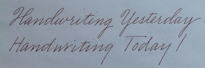
 National Handwriting Day is this week and once again the great cursive war has sprung into the news. What is this cursive term over which people have become so polarized? When most speak today of cursive they refer to the handwriting of America’s late 19th and early twentieth century – full of cumbersome loops and unwieldy connections. Not so. The term cursive has been around for centuries and simply means connected.
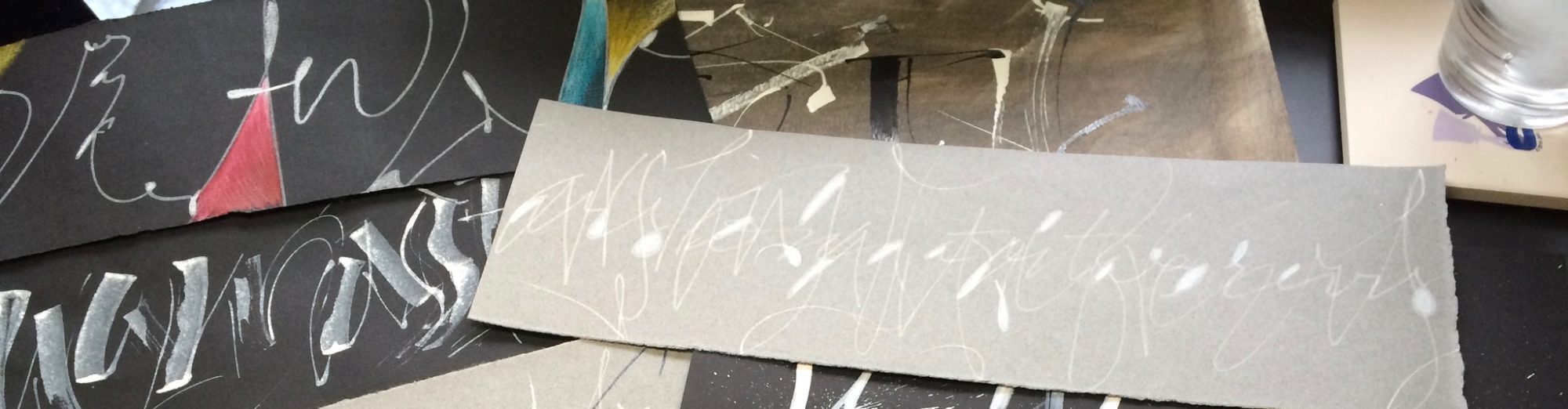
The Weekly Letter – B is for Bookmaking
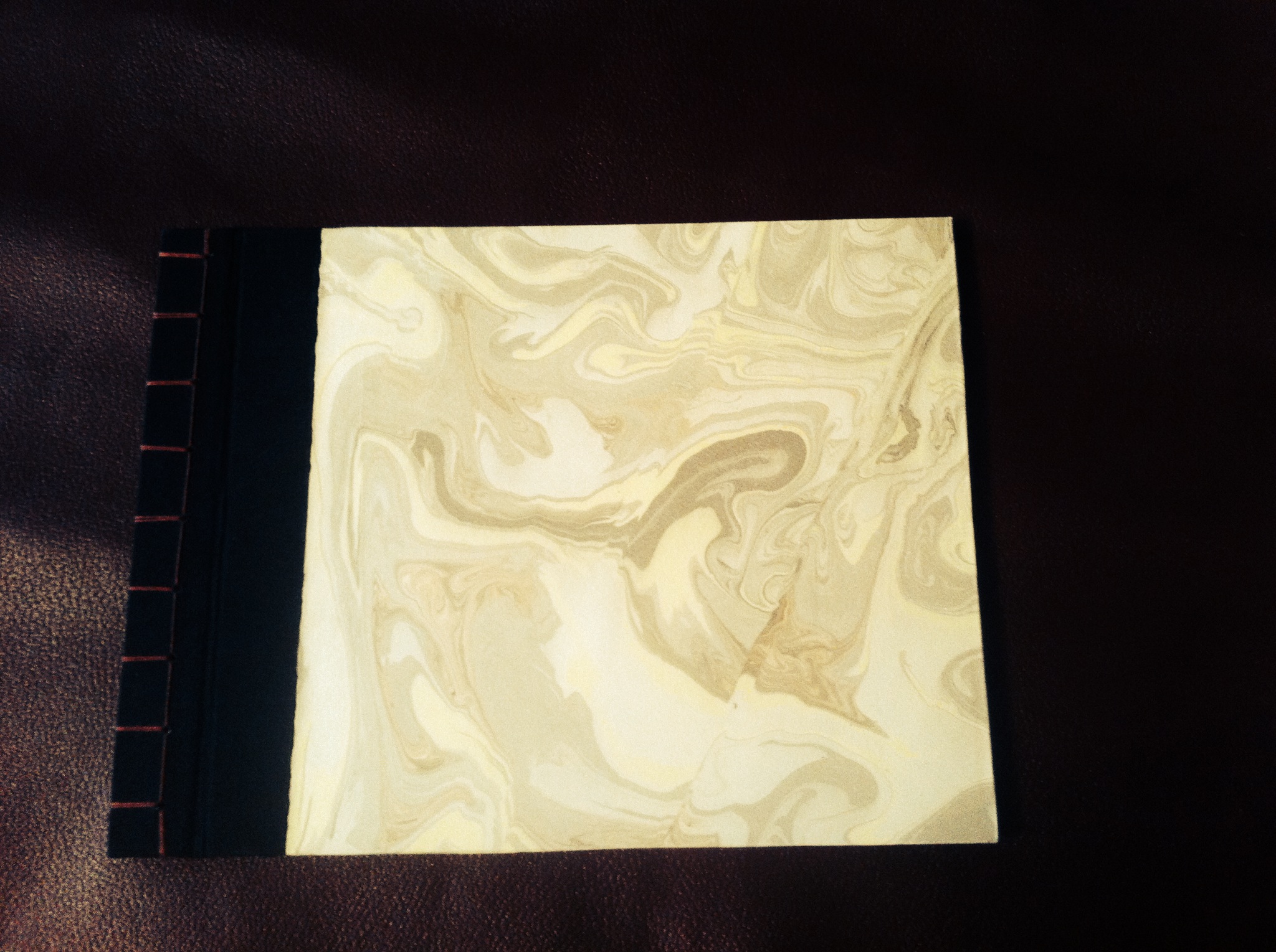 Making books is often a natural progression for those of us who love letters. Sometimes I begin with a binding in mind, but this one started with a stack of suminagashi (japanese marbling) paper I had made. The paper is Arches text wove and the ink is sumi. At first I had thought to use each sheet individually, but they seemed to belong together.
As I began to envision them as a book, I added black Hahnemühle Ingres paper between each sheet. I chose the Japanese stab binding because I wanted to be able to take it apart for writing, adding more pages or rearranging the order. The covers are Davey board, black bookbinding cloth and burgundy thread.
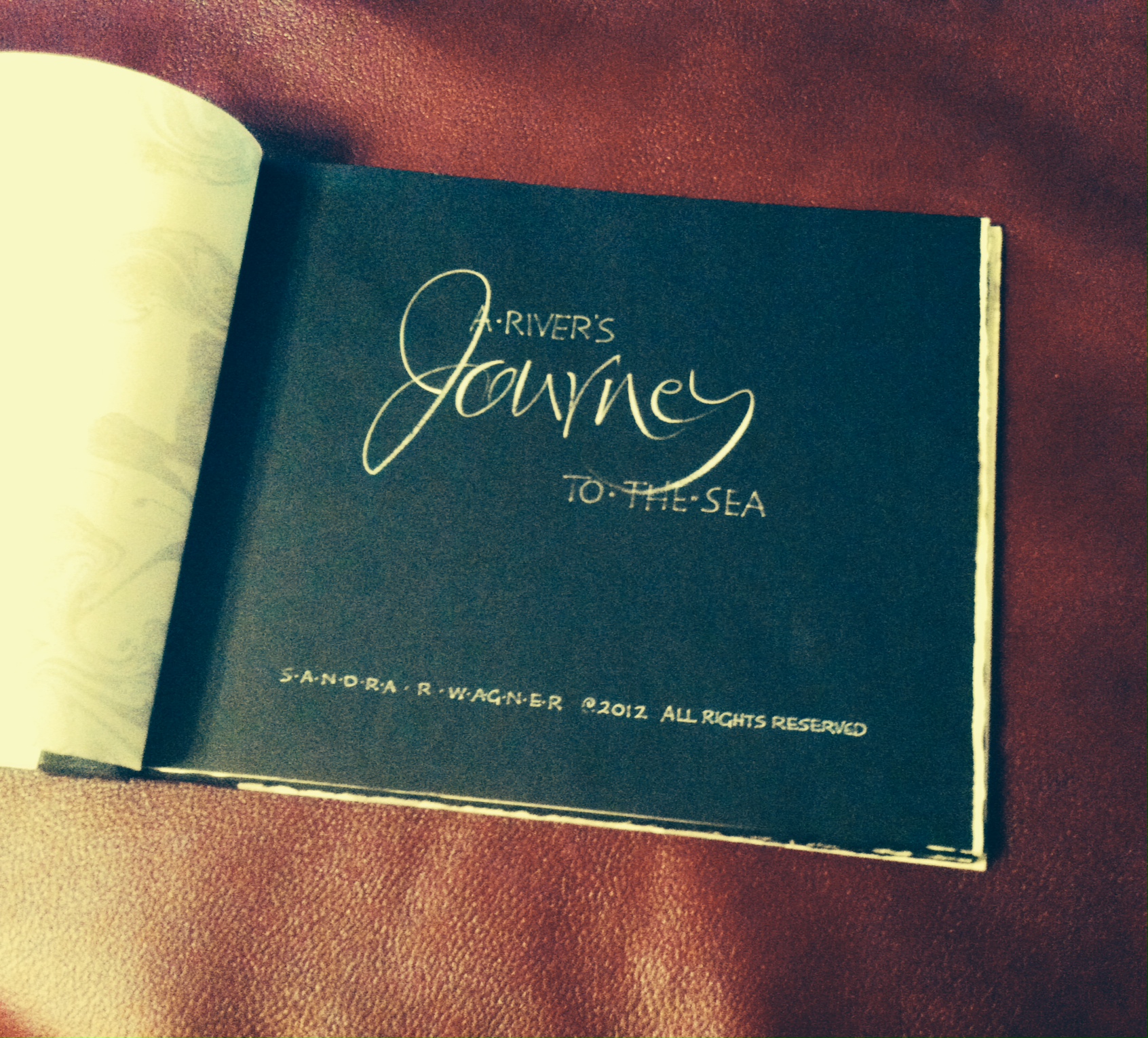
But what to write? The paper seemed to call out for something about water. Rivers, perhaps? As I searched for a text, most of the public domain poetry seemed too old-fashioned for the simple feel of the paper. Contemporary words were often copyrighted. With this in mind, I considered Haiku or Tanka (similar to Haiku but with more lines using simile, metaphor and personification). I settled on using my own Tanka and A River’s Journey to the Sea for the title.
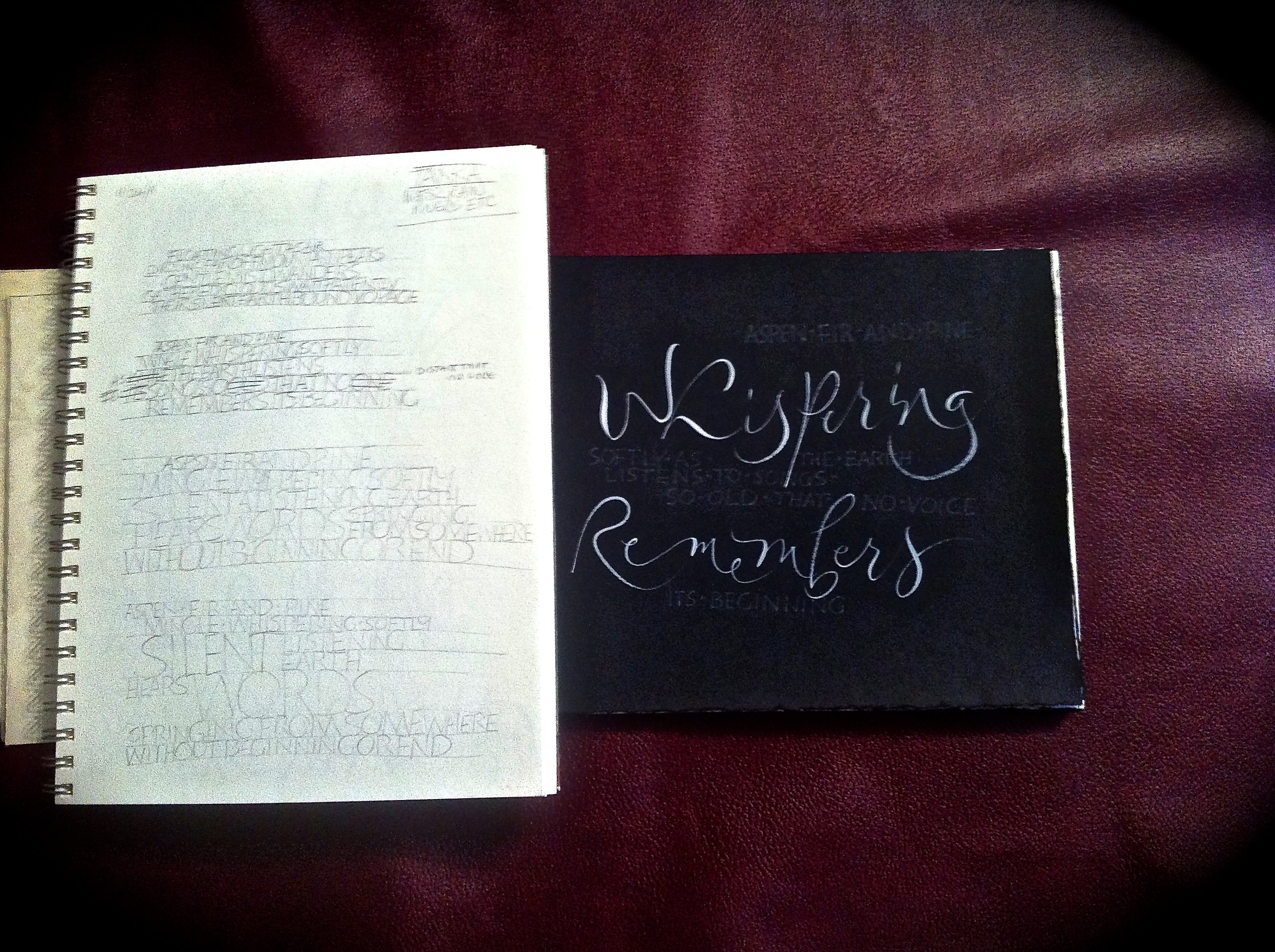 Now with a goal firmly in mind, I began the writing. Thirty-one syllables, five lines, one thought. Little by little each of the tanka began to emerge as mist wandering in clouds to storms, rushing waters and finally an exit to the sea. Each tanka has been written and rewritten in pencil, monoline caps and finally combining brush letters with caps. Meanwhile I searched for a white gel pen that wouldn’t fade into the paper (I settled on the Uni-ball Signo) and ink (Bleedproof white) for the brush letters.

I’m still searching for a way to connect the texts visually, so the book is still a work in progress. When I’ve found that moment that says “Finé”, I’ll post some of the final photos. Meanwhile, like a river this book remains in motion.
Carriage House Calligraphy
 Welcome to Carriage House Calligraphy. As a lettering artist, my work is multi-faceted and can encompass anything from fine art to bookmaking and much more. Often my calligraphic skills are requested for weddings and special events. To make it easier to find that information, I’ve created Carriage House Calligraphy, a unique part of my business that specializes in handwriting for your special event. Here you will find information about everything from hiring a calligrapher to current information about lettering styles, pricing and even the latest in decorations and colors. I hope you enjoy my posts on event calligraphy. Feel free to contact me for more information.