When I first began as a calligrapher in the 1970’s, my entire studio consisted of a drawing table, slant board, duplicator (nowadays copier) paper, Osmiroid pen, Pelikan 4001 ink, rulers and pencils. For nice work, we used bristol board. A lot of my work involved paste-ups, rubylith film and professional copying for publication. Other things like envelope addressing and filling in certificates were standard fare. I have to admit that I never gave a thought to the ink fading or the paper disintegrating.
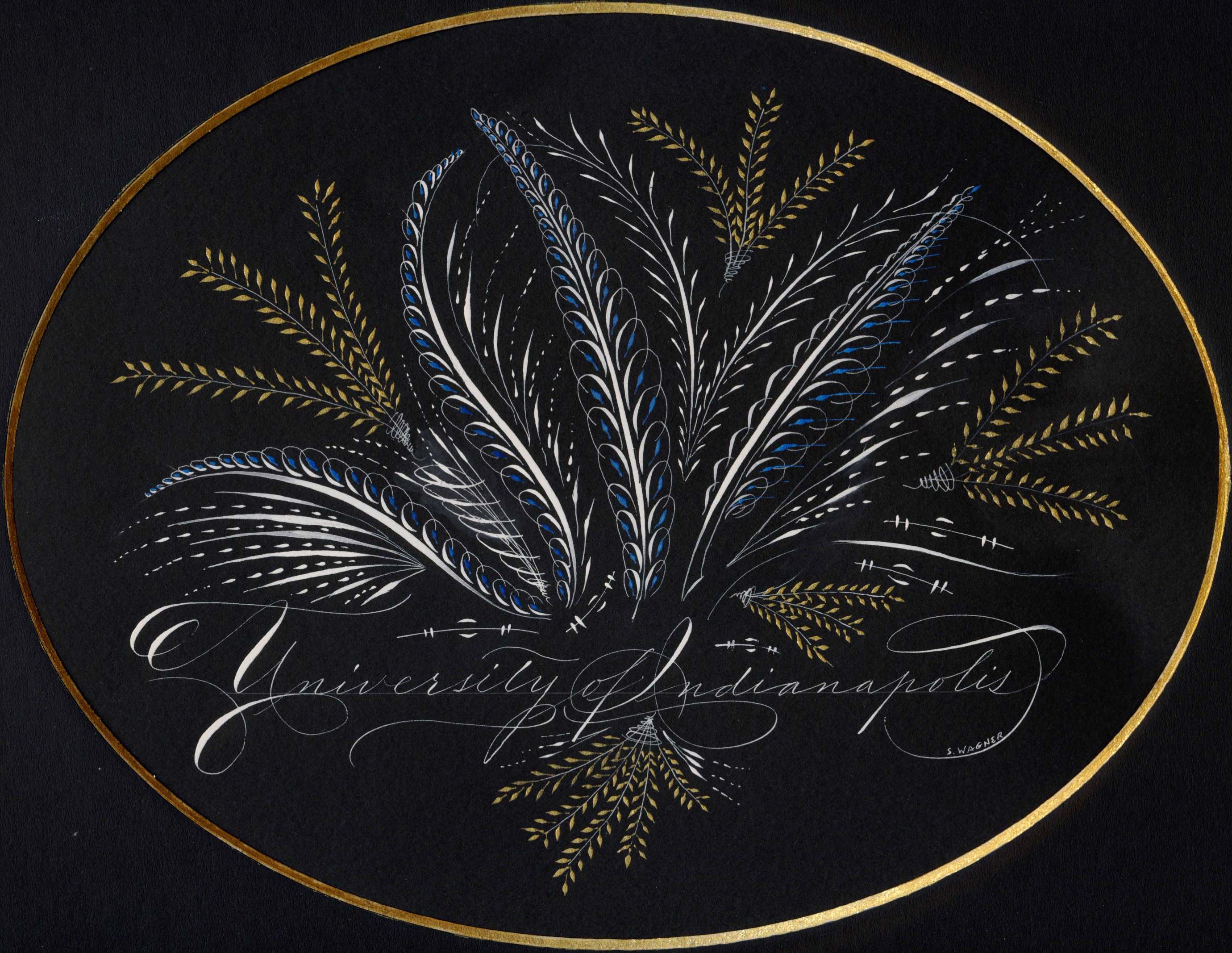
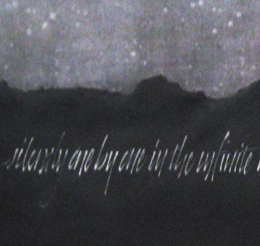
Now years later and a whole lot wiser, I know that it should be one of the first things one considers. Take a look at the piece below. It’s Dr. Martin’s Bleedproof White, Daniel Smith Iridescent Watercolors and Canford Black Paper. Click on the thumbnail and look a bit closer. See that slightly lighter black oval? That’s the place where the matte covered the black paper while it was framed. The piece was on display for less than a month and never in direct sunlight. Wouldn’t you feel badly if you sold this to someone and a year or so down the road the black paper simply faded away?
Canford is a beautiful shade of black and wonderful to write on. But it, along with MiTientes fades in the sun and fairly quickly as you can see. Not a big deal if you’re practicing or jotting off a quick greeting card. But not for a piece you spend hours on and one that you’d like to last. And it’s not just paper than can cause problems. Ink and paint can also fade or change color with time. Reds are notorious for turning this ugly shade of brown. And some ink, like oak gall, can actually eat away at your paper. Our local historical society is currently in a race against time to preserve documents written in the 18th and 19th centuries where the ink is literally eating holes in the paper.
How do you know then what to use? Paper should be acid-free. Paper designed for printmaking and watercolors from good mills such as Arches, BFK, Fabriano, etc. may be a bit more pricey, but it won’t deteriorate with time. If you’re in doubt about a dyed paper, take a small strip, cover half with a piece of cardboard and hang it in a southern window for a month or so. Like the Canford above, the exposed portion will fade in the sun.
What you paint and write with is as important as the support. Acidic inks such as oak gall will eventually rot the paper underneath. Ink in markers or designed for fountain pens are usually dye based rather than pigment and often will fade or change color. So if you haven’t learned to load a dip pen with a brush, now’s a good time. You’ll have a whole new range of materials available to you such as watercolor, gouache, acrylics and caseine.
Buying pigment based materials isn’t without its pitfalls. There is good information available online, or in books such as Hillary Page’s or Michael Wilcox’s watercolor books, about pigments are stable and those that are considered “fugitive”. A good rule of thumb is that if the label doesn’t list the pigments, you probably don’t want to buy it. For instance, alizaron crimson is a fugitive red. Its color will shift with time to a rather dull brownish red, either alone or mixed with other colors.
Lastly, it always pays to purchase quality art materials. Artist quality paint will cost a bit more, but in the long run because they have more pigment and less filler, will give you a better result. Meanwhile use up that inexpensive paper, markers and dye based inks for practice or give them to the grand-kids to play. Who knows you may have another budding artist in the making.
