Those Marvelous Margins

I don’t think one can say this too many times.  Margins are important, perhaps the most important part of a work.  They are the frame within the frame; a place for the eye to rest while soaking up the artwork or letters contained within.


So why do so many contemporary calligraphers and book artists neglect these wondrous white (or background) spaces?

Here are two photos of same blackletter page.  One has had the margins cropped off.  The original has breathing room.  It allows you to appreciate the texture of the lettering, to notice the darks and lights of the majuscules and to focus on whole words and sentences.  The other should, even if you’ve never studied layout and design, make you slightly claustrophobic.

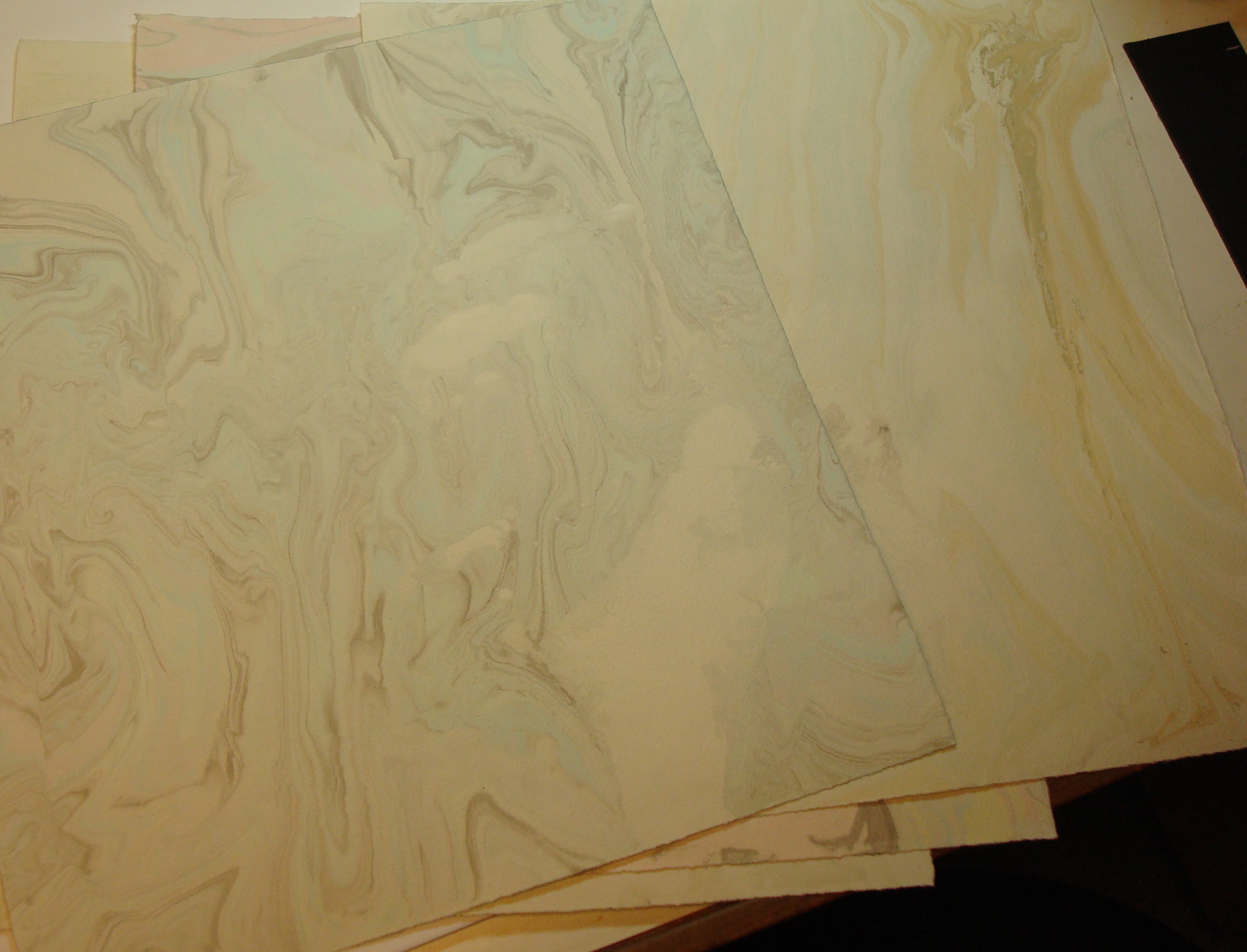
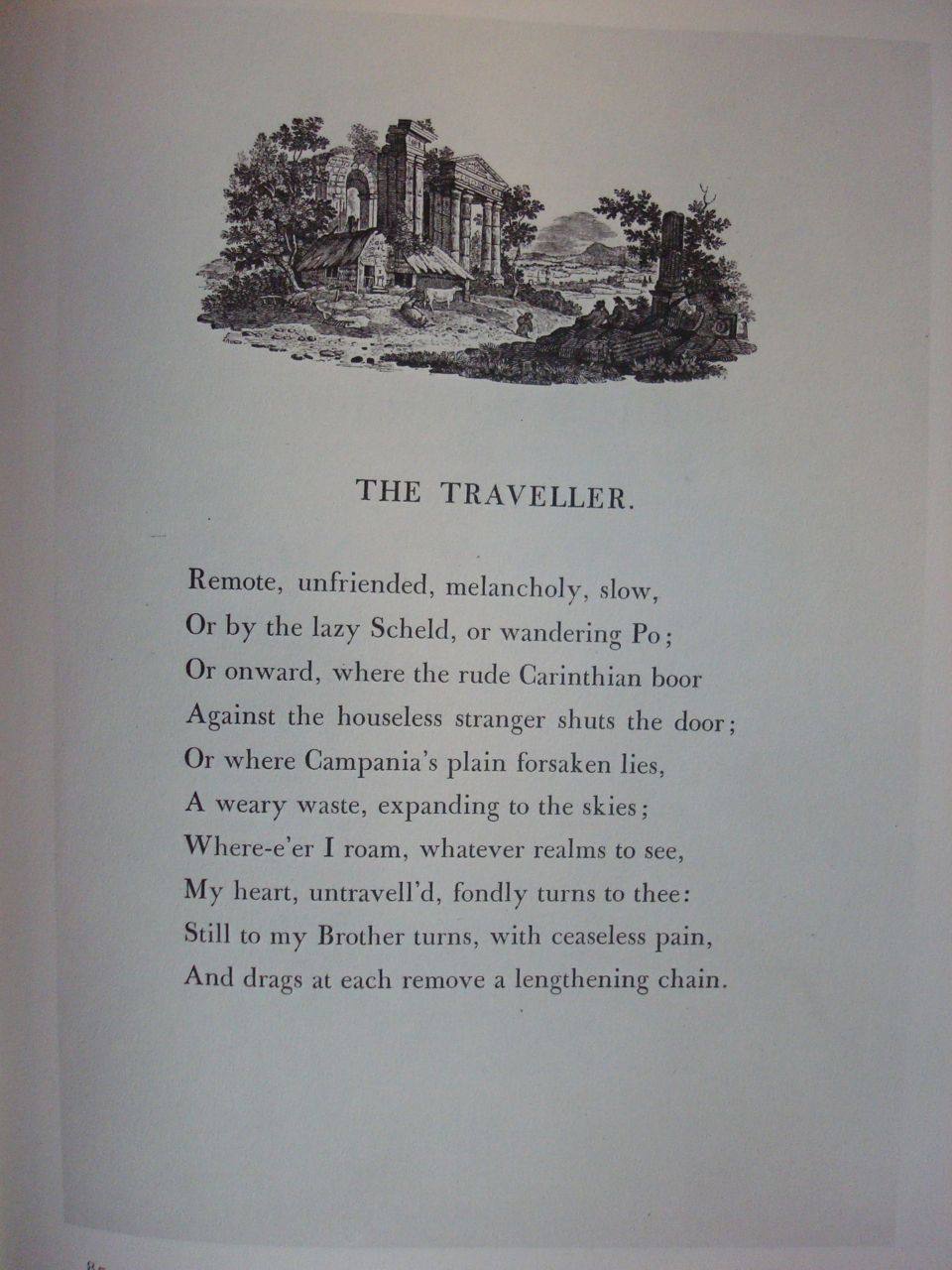
Manuscript page design has changed little since the first books were written.  Whether you’re looking at a page from the Book of Kells  or browsing the Saint Johns Bible Website, you will see margins that enhance the readability and artistic design of the page. Two very fine resources for studying traditional margins are The Calligraphers Handbook, edited by Heather Child (the paperback with the blue cover) and Edward Johnston’s Writing and Illuminating and Lettering.

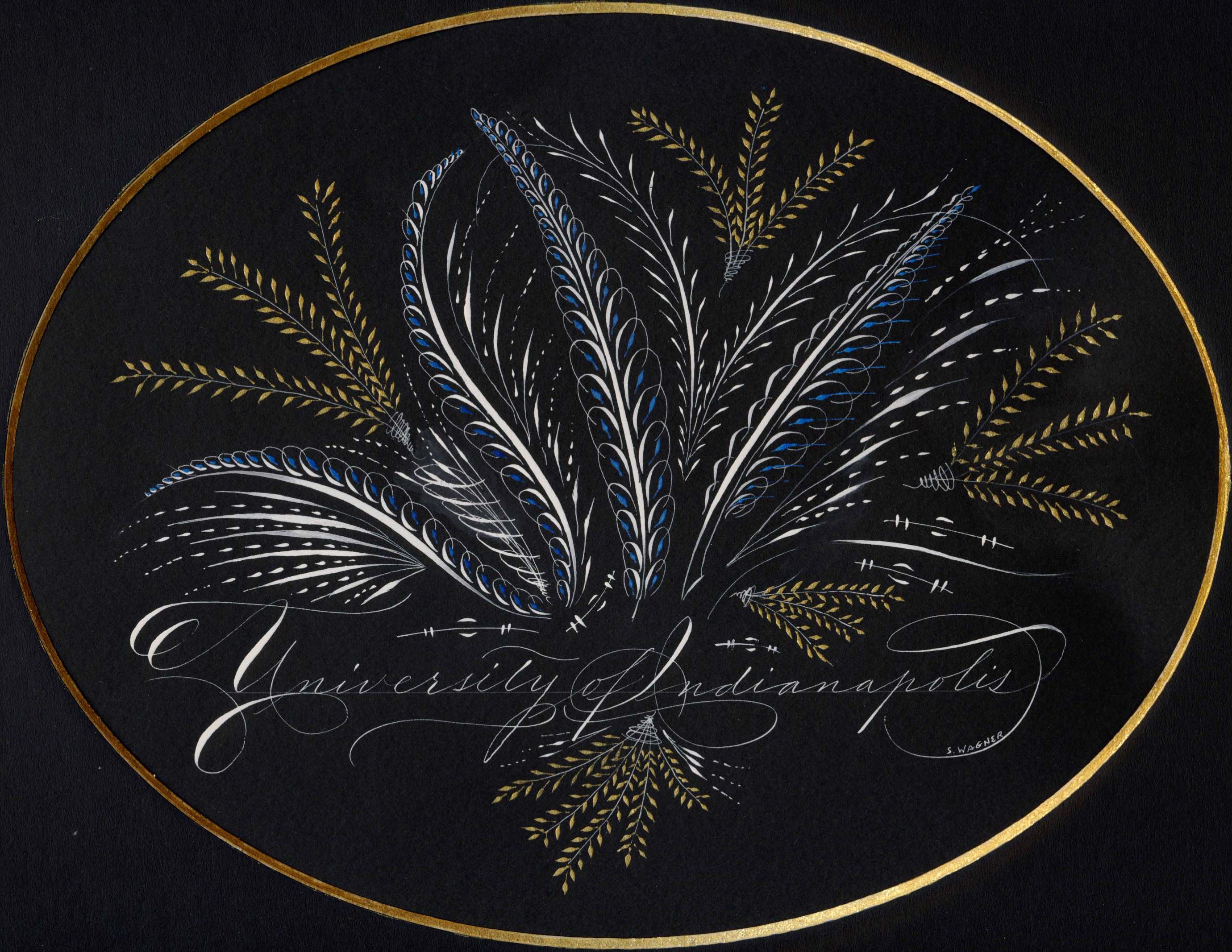
But what if you’re not designing a page in a book? What about contemporary art, addressing envelopes, or making a broadside?  Space still matters.

For more contemporary studies, Sheila Water’s Foundations of Calligraphy and Annie Cicale’s The Art & Craft of Hand Lettering both contain chapters devoted to layout and design.

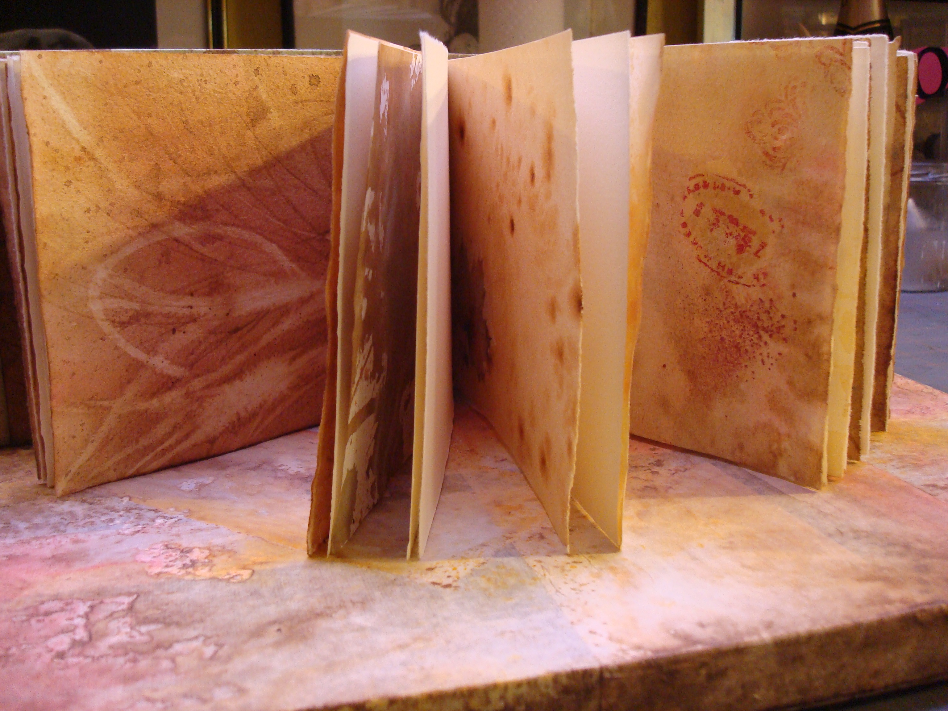
 Studying good calligraphic art is also a very good way to educate your eye.  But as you dissect and study letter forms, don’t forget to look for what isn’t there, those magical places above, below, around and between. Margins, interlinear space, anywhere the lettering is NOT is equally as important as the finest letters you can create.

Fun with ink and water

It’s no secret that  I love using water techniques. I love the spontaneity and the often surprising results. I’ve been experimenting with suminagashi the last week or so.  Although similar to more modern marbling techniques, it is a very old technique, and has the benefit of needing only water and ink rather than all the preparation for oil based marbling.  For me, I like the informality, the more delicate colors and textures along with the less structured forms.

I’m fortunate to have a very large (and very old) concrete double washtub in a basement laundry room.  Couple that with our daughter’s left behind dark room materials and I have a made to order suminagashi playground.

The trays are made for photo developing and come in myriad sizes. These are large enough to accomodate an eighth sheet of Arches velin. I elevated them to a more workable height using plastic storage milk crates.  Definitely saves your back.  One tray is for the ink and the other for rinsing.

You can purchase sets of suminagashi inks from art supply catalogs.  They work well, but I’m not particularly fond of the colors. They’re very bright, but they blend well and with a little mixing you can get some lovely browns and greys.  You can also experiment with acrylics for a more water resistant design.

For black, I use ordinary bottled sumi inks.  The brushes are inexpensive Chinese hair.  The most important ingredient is either Ox Gall or  PhotoFlo.  The latter one can get it from photographic dark room suppliers.   Add a drop or two to each color and to your clear water.  It makes the ink float on the surface rather than sink.  Go easy, you can always add another drop or two if the colors are sinking.


Loading one brush with clear water and the other with ink, alternate lightly touching the water. Traditionally it’s done in concentric rings and you can find several Youtube videos to see the technique.  But there are many ways to create shapes floating on the water.

Experiment with touching the water in different places, alternating clear with sumi, lightly brushing or fanning the water or blowing on the surface gently.  When you think you have a design you like, hold the paper with a slight bend in the center (so it touches the water first) and lay the paper gently on the surface.  You can ink only one side, flip the paper over, or submerge it to allow the ink to flow over the top of the paper.  The more you disturb the ink, the more spontaneous the designs.  Rinse them gently to remove the excess ink.

I hang them on a clothes line to drip dry. It’s not necessary but I then place them between blotting paper and into a paper press to completely flatten and dry. The rest is up to your own imagination.  End papers, covering book boards, backgrounds for lettering, the possibilities are endless.  The patterns are so lovely, you may find them attractive all on their own.  Enjoy!

Workshop remnants

In the previous post, I added that I’d cut my workshop papers to fit into a coptic bound sketchbook similar to the ones I’d made before.


The papers are interspersed with plain sheets of Arches text.


There are seven signatures and just for fun, I included beads in the sewing. As in the other books, I will used this one for sketching, adding lettering, collage elements, etc. wherever the papers lead me.

Keeping a Sketchbook

I began keeping loose-leaf notebooks some thirty years ago when I attended classes and workshops.  In the beginning they included not much more than some exemplars and practice lettering sheets.  When I found I was becoming a pack rat, I realized that it made more sense to place the exemplars in clear sheet protectors and keep only those bits and pieces that I knew I might revisit when the creative muses were on vacation.

Later, as I added classes in life drawing, watercolor and pastel, I switched to spiral bound sketchbooks.  I still use notebooks for exemplars, but now I use the sketchbooks to take notes, cut and paste small examples from workshops, and to experiment with design, color and tools.  They have become an invaluable reference.

Quick Tip for Chapped Hands

If you’re like me you spend a lot of time with your hands in water.  Whether rinsing out brushes, sponges and rollers or using various wet techniques to wash backgrounds.  The combination of water and dry winter air can make for some pretty rough skin; what the commercials of the 1950’s called “dishpan hands”. In the spring, I’m also an obsessive gardener and the wet dirt isn’t much easier on the hands.  It seems like no amount of hand lotion helps. One thing that has helped my hands over the years is a product called “Bag Balm”.  Designed in the 1890’s to heal cracked udders on milking cows, it soon found its way into the kitchen and a host of other places.  I haven’t the foggiest idea how it works, but it does and that small green can will last forever.

Why Use Good Materials?

When I first began as a calligrapher in the 1970’s, my entire studio consisted of a drawing table, slant board, duplicator (nowadays copier) paper, Osmiroid pen, Pelikan 4001 ink, rulers and pencils.  For nice work, we used bristol board. A lot of my work involved paste-ups, rubylith film and professional copying for publication.  Other things like envelope addressing and filling in certificates were standard fare. I have to admit that I never gave a thought to the ink fading or the paper disintegrating.

Now years later and a whole lot wiser, I know that it should be one of the first things one considers.  Take a look at the piece below.  It’s Dr. Martin’s Bleedproof White, Daniel Smith Iridescent Watercolors and Canford Black Paper. Click on the thumbnail and look a bit closer.  See that slightly lighter black oval? That’s the place where the matte covered the black paper while it was framed.  The piece was on display for less than a month and never in direct sunlight.  Wouldn’t you feel badly if you sold this to someone and a year or so down the road the black paper simply faded away?

Canford is a beautiful shade of black and wonderful to write on.  But it, along with MiTientes fades in the sun and fairly quickly as you can see.  Not a big deal if you’re practicing or jotting off a quick greeting card. But not for a piece you spend hours on and one that you’d like to last.  And it’s not just paper than can cause problems.  Ink and paint can also fade or change color with time.  Reds are notorious for turning this ugly shade of brown.  And some ink, like oak gall, can actually eat away at your paper.  Our local historical society is currently in a race against time to preserve documents written in the 18th and 19th centuries where the ink is literally eating holes in the paper.

How do you know then what to use?  Paper should be acid-free. Paper designed for printmaking and watercolors from good mills such as Arches, BFK, Fabriano, etc. may be a bit more pricey, but it won’t deteriorate with time.   If you’re in doubt about a dyed paper, take a small strip, cover half with a piece of cardboard and hang it in a southern window for a month or so.  Like the Canford above, the exposed portion will fade in the sun.

What you paint and write with is as important as the support.  Acidic inks such as oak gall will eventually rot the paper underneath. Ink in markers or designed for fountain pens are usually dye based rather than pigment and often will fade or change color.  So if you haven’t learned to load a dip pen with a brush, now’s a good time.  You’ll have a whole new range of materials available to you such as watercolor, gouache, acrylics and caseine.

Buying pigment based materials isn’t without its pitfalls.  There is good information available online, or in books such as Hillary Page’s or Michael Wilcox’s watercolor books, about pigments are stable and those that are considered “fugitive”.  A good rule of thumb is that if the label doesn’t list the pigments, you probably don’t want to buy it.  For instance, alizaron crimson is a fugitive red.  Its color will shift with time to a rather dull brownish red, either alone or mixed with other colors.

Lastly, it always pays to purchase quality art materials.  Artist quality paint will cost a bit more, but in the long run because they have more pigment and less filler, will give you a better result.  Meanwhile use up that inexpensive paper, markers and dye based inks for practice or give them to the grand-kids to play. Who knows you may have another budding artist in the making.

Studio Tip – Paper Storage

Acquiring paper is addicting.  Organizing it in a small studio can be quite a challenge.  Here are a few ideas that work for me.  First, make labeling a habit for watercolor, printmaking and other plain papers.  There’s nothing more frustrating than finding a paper you love to work with and being unable to remember what you purchased.  For large sheets, I often buy in bulk and just keep it flat in it’s original labeled shipping plastic.  But when I cut them down, I take a pencil and lightly mark a corner so I can keep track of what it is.  It can erased, cut off or just left under the matte when you frame.


I don’t currently have room for a flat file to store large sheets of paper.  So I’ve opted for a dual solution.  Lightweight papers are hung with clip hangers on a clothing rack, both purchased at our local Target.  It’s much easier to sort through them that way and you can roll it around and out of the way.   It’s not ideal, and  papers that are too heavy will fall on the floor,  but since most will be torn down and used for collage it’s not really important that they stay perfectly flat.  Rice papers that can be rolled are stored in the flat boxes readily available at places like Target and Walmart.  Heavier papers such as Arches Cover and watercolor stock can then be laid flat on top.

I should mention that there is something wondrous in watercolor sizing that attracts small animals. You can imagine I was none to pleased to find the corners of five sheets of 300# Arches cold press eaten by my favorite poodle! I now  make sure the plastic is secure.

Lastly, I would be remiss if I didn’t mention a bit about canvases.  Rice paper and canvas make a lovely combination but they also need somewhere to dry.  Once again, necessity was the mother of invention. My studio is an amalgam of a furnace room, laundry room and 50’s basement “social room”. The clothes line is perfect for paste papers and an inexpensive drying rack works for canvases.


New studio tips

Artists, and especially those involved in the calligraphic arts, are by nature a sharing group.  Many of us can be found on message boards such as Cyberscribes, IAMPETH and Ornamental Penmanship.  They are great places to meet other artists and we often share tips and techniques. When I respond to a post, I have sometimes received requests to share my answers in guild newsletters as well.  So I thought I might add a category here where I can share some of those little tidbits of knowledge that I’ve picked up over the past thirty years; occasionally from other artists, some from workshops and a great many from that old word “experience”.

Here’s one for today: When I stock up on ink that I use often, such as Dr. Ph. Martyn’s Bleedproof White, I label the top of the container with the date purchased. I use a waterproof marker (white works on the black lids). This way I always open the oldest stock first to avoid finding a dried out container of ink or paint.