Dominus Vobiscum (detail)

Exhibited in the 2010 Washington Calligraphers Guild Juried Exhibition, Dominus Vobiscum incorporates acrylic, gouache and sumi lettering done after painted double shuen paper has been collaged onto a 16×16″ gallery wrapped canvas.

Acrylic Mediums

 Back to the studio.  This week I’ve been working with acrylic mediums.  For those who aren’t familiar with acrylics, the various gels, pastes and liquid mediums allow for shapes and color to be applied in various glazes and textures. This also allows for lettering on and between layers.  For more detail click on the thumbnail.

This is a 16×16 canvas collaged with unpainted double shuen.  It was then covered with a layer of white wash so that when it was dry I could use water media to write and also to allow me to impress letters into the surface.  If you look closely at the detail below you’ll see small block letters rising like bubbles from the sea.

There are more collaged papers giving the illusion of fish. The raised “seaweed” was created with gesso thinned with matte medium applied with a squeeze bottle. The illusion of sand was created with mica gels. The various layers of color are acrylic glazes.  I’ve posted the work here before any lettering is applied so that you can see the underlying structure more easily.


Something New

Just having fun with the alphabet, here’s a 10×24 canvas covered in double shuen, multiple layers of collage, text and pastel. Using watercolor, walnut and sumi inks, graphite and Dr. Martin’s Bleedproof white, and a bit of gold dust, there’s lots going on. You might even spot some life drawing if you look closely.


Click on thumbnail for complete image.

Work In Progress

This 24×30 gallery wrapped deep canvas piece that’s still in the works. The photo probably doesn’t do the detail justice. I began by covering the entire surface with double shuen paper using rice paste. That was followed with walnut and sumi ink spritzed and brushed on; then a coating of 50/50 matte medium. Still not satisfied with the surface, I then pasted more shuen papers that have been rolled with black relief paints. On top of that are acylics both brushed and rolled.  It still isn’t finished as I’m experimenting with text and color to add yet another dimension.  I enjoy the process of slowly building up the design gradually until it has a satisfying balance of both texture and color.


Click on the thumbnail for more detail.


Silently, the Stars (detail)

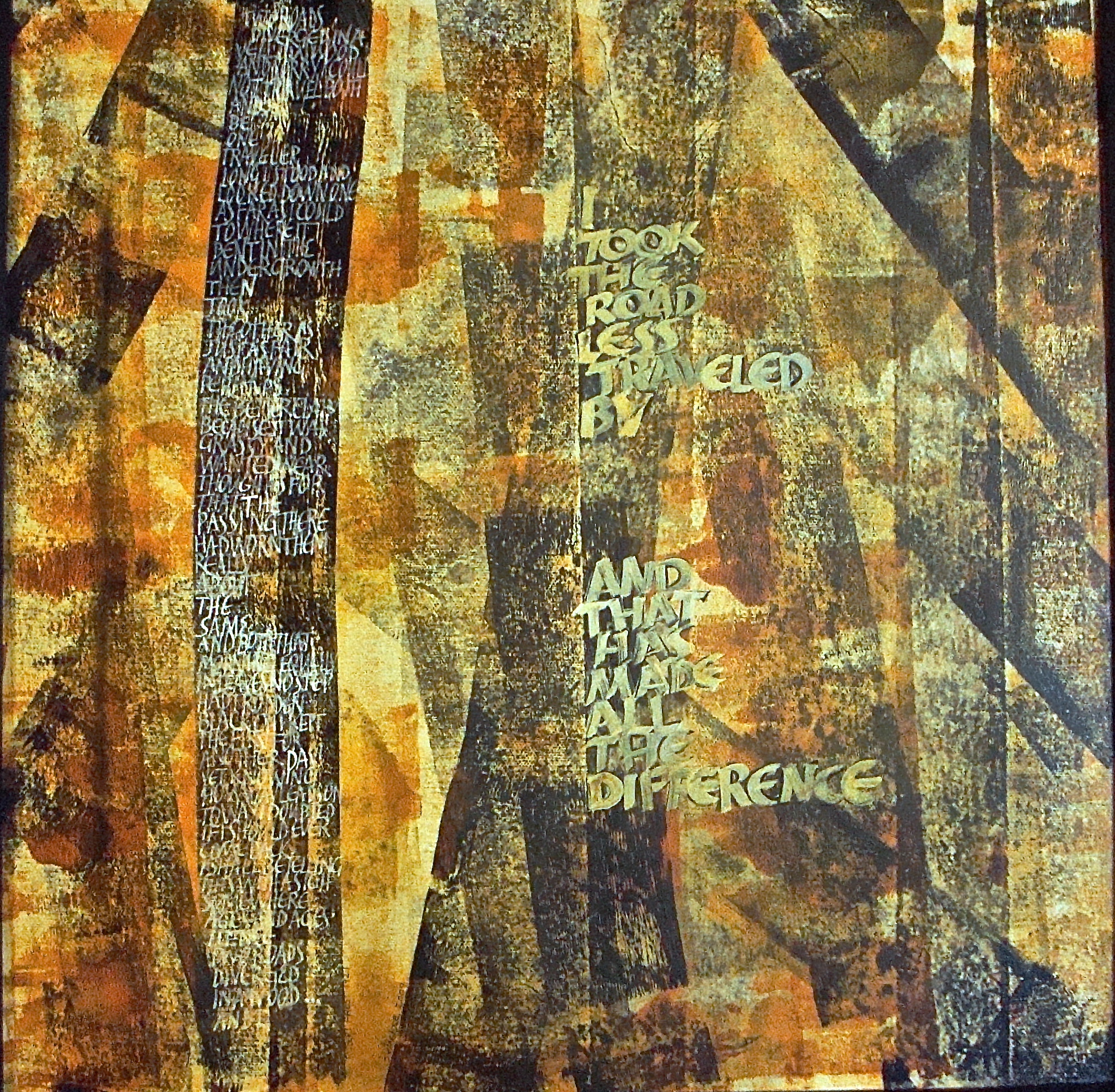
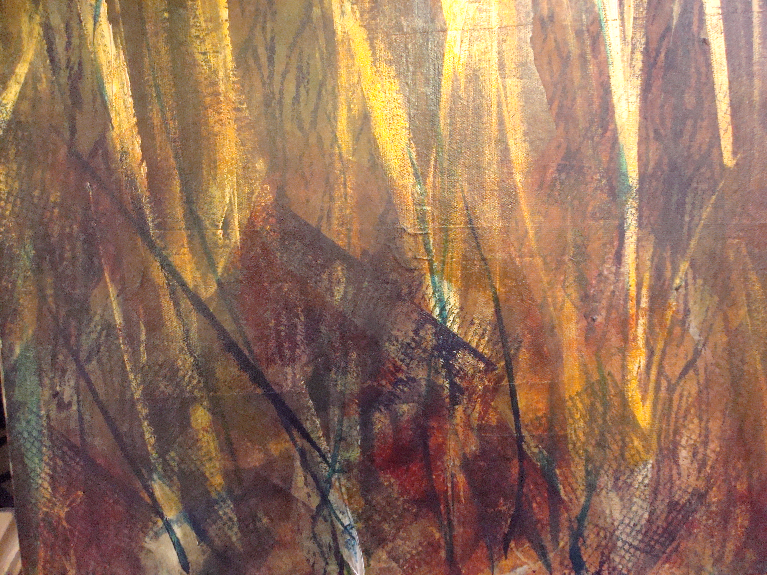
Some might ask which comes first, the text or the art?  Like the proverbial chicken and egg, there is no right answer.  In this case, although I have used this text many times, the art was the inspiration for the words. The canvas is 10 X 24 gallery wrap.  The medium is collaged rice papers which have been stained or painted with sumi ink and Daniel Smith relief inks.  The writing is ruling pen and white gouache.

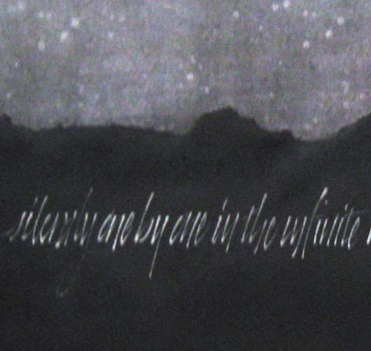
Silently, one by one in the infinite meadows of heaven, blossomed the lovely stars, the forget-me-nots of the angels. 


Henry Wadsworth Longfellow (1807–1882) Longfellow was one of the most popular 19th century American poets.

To view the piece in it’s entirely click on the thumbnail to the right.


Wine and Art

I’m a saver, some might even say hoarder, so there are often random bits of paper or unfinished canvases roaming about my studio. Sometimes it’s a canvas that just isn’t working and it can be tempting to toss it out or paint over. Several were just lying around last fall when I needed a piece for an upcoming exhibition.  Staring at this one, I started to randomly associate words with the visual.  Words such as trees, paths and roads ultimately led to the Frost text used here and, like wine aging in a cask, partially worked canvas became art.