The Weekly Letter – D is for Save the Date

savethedateValentine’s Day is quickly approaching and many young and ‘young at heart’ will be making plans to tie the knot. If you’re one of those lucky young couples setting a date to be married , you may be wondering if Save the Date cards are necessary. And if so, how soon should we send them? Much will depend upon your guest list and wedding location. How many guests are you inviting? How flexible is your invitation list? How far do your guests have to travel? What sort of wedding – local or destination, church, hotel or resort – are you considering? What is your budget?

I won’t bore you with “back in the day” stories about how everyone lived in the same town and events were simpler. Weddings, like lives, are a lot more complicated nowadays. People live all over the world and schedules are less predictable. Presuming you’re going to tell all your family and friends about your engagement and have a small intimate family event, word of mouth may be all that’s necessary for them to put the date on their calendar. You can always call those few out of town relatives and share the good news along with your plans. Sending your invites in a timely manner should be all that’s necessary.

But what if you’re planning a large wedding with folks from all over the planet? Or perhaps a destination wedding? People need to make travel plans, book airplane and hotel reservations. Save the Date cards can be just the ticket for letting your friends and family plan ahead. You share the joy of your engagement and give everyone a heads up about the date and place. If this is the case, then now, not later, is the time to lock in details including the ultimate guest list, venue, reception size, costs, etc.

Receiving a Save the Date card implies a guest will be receiving an invitation. You can’t really go uninviting people ten months later. I won’t even go into the habit of some folks having second and third tier invite lists, but suffice to say you might have some pretty angry friends or family members if they were omitted from one list or the other. You can always send out engagement announcements instead without letting the cat out of the bag on your wedding plans.

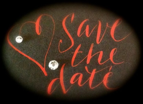
If you’ve made up your mind to send Save the Dates, your options are limited only by your imagination. There are postcards, magnets, and a host of other ideas in magazines and online. If it can be mailed, it’s a possibility. Some photographers take engagement photos if you book them for your wedding. These make nice postcards. As a calligrapher, I can use with permission, photos of you, your destination or even a special moment, adding calligraphy to the image before you have them printed. I can design original artwork for you. I am also available for addressing those cards in either handwriting or calligraphic scripts.

Just remember, calligraphy and design takes time. If you’re thinking about using Save the Date cards, contact me soon before my calendar fills up for this coming wedding season.

The Weekly Letter – C is for Cursive

handwriting sampleNational Handwriting Day is this week and once again the great cursive war has sprung into the news.  What is this cursive term over which people have become so polarized?  When most speak today of cursive they refer to the handwriting of America’s late 19th and early twentieth century –  full of cumbersome loops and unwieldy connections.   Not so. The term cursive has been around for centuries and simply means connected.

Continue reading “The Weekly Letter – C is for Cursive”

Ultimat Vodka Bottle Signing

Happy Holidays!  I’m privileged to have been asked to create handwritten Ultimat Vodka bottles at local liquor store events throughout the holiday season.  Wednesday was our first event and along with the Ultimat Brand Associate and the young gal in charge of the tastings, we had a successful and wonderful evening at 21st Amendment Liquors. The bottles are beautiful and I’m looking forward to more events in December.

The Weekly Letter – B is for Bookmaking

photo 1Making books is often a natural progression for those of us who love letters. Sometimes I begin with a binding in mind, but this one started with a stack of suminagashi (japanese marbling) paper I had made.  The paper is Arches text wove and the ink is sumi.  At first I had thought to use each sheet individually, but they seemed to belong together.

As I began to envision them as a book, I added black Hahnemühle Ingres paper between each sheet.  I chose the Japanese stab binding because I wanted to be able to take it apart for writing, adding more pages or rearranging the order.  The covers are Davey board, black bookbinding cloth and burgundy thread.

But what to write?  The paper seemed to call out for something about water.  Rivers, perhaps?  As I searched for a text, most of the public domain poetry seemed too old-fashioned for the simple feel of the paper.  Contemporary words were often copyrighted.  With this in mind, I considered Haiku or Tanka (similar to Haiku but with more lines using simile, metaphor and personification).  I settled on using my own Tanka and  A River’s Journey to the Sea for the title.

IMG_4711Now with a goal firmly in mind, I began the writing.  Thirty-one syllables, five lines, one thought.  Little by little each of the tanka began to emerge as mist wandering in clouds to storms, rushing waters and finally an exit to the sea.   Each tanka has been written and rewritten in pencil, monoline caps and finally combining brush letters with caps.  Meanwhile I searched for a white gel pen that wouldn’t fade into the paper (I settled on the Uni-ball Signo) and ink (Bleedproof white) for the brush letters.

photo 2

I’m still searching for a way to connect the texts visually, so the book is still a work in progress. When I’ve found that moment that says “Finé”, I’ll post some of the final photos.  Meanwhile, like a river this book remains in motion.


The Weekly Letter – A is for Anyone can do that!

Partly for my own discipline as well as a means of sharing years of experience with those who read my blog, I’ve decided to start a weekly post entitled The Weekly ‘Letter’.  Since it seemed appropriate to begin with the letter “A”, here goes :  “Anyone can do that!”.

Anyone can write addresses on an envelope. Sure. We all learned to write in school and for some of us, we wrote years of class notes and exams. But can we do it well?  And how do you decide if calligraphy is done well?

A few years back, I was asked to teach calligraphy at our local library.  When I inquired about the parameters, the very nice woman in the central office said “Oh, we’d like you teach Italic writing”.  I subsequently inquired as to how many weeks they were thinking about.  To which she replied “Weeks?  Oh no, one two-hour session on Saturday morning.  Twenty-four branches”.  Insert pregnant pause here while I consider how to respond without actually crying or laughing out loud.

I took the gig, but with the following caveat – you can’t learn calligraphy in two hours on a Saturday morning.  The world is full of “instant” this and that.  One particular local piano teacher offers “learn to play the piano in a day” classes.  Not sure what that entails, but I began playing piano at age nine and I didn’t really reach any sort of competency until about eighth grade.

I did however think that people could learn a bit about the history, tools and techniques.  And most of all, that I could educate an audience about what “good calligraphy” looks like.  Even beginners can be taught to see consistency in letter shapes, slant and spacing.   And even more importantly, they can come to realize that what we do took hours of practice.  That’s what I taught.

So how, in this age when calligraphy can mean anything from highly skilled lettering to scribbling on canvas, do I know if calligraphy is “good”? First, let’s throw out the word “good”.  It’s way too subjective.  Instead let’s look at some ways to view a piece of calligraphic art.

What is it’s purpose?  If you’re hunting for someone to address your envelopes for an event or wedding,  you’re looking for fine handwriting. We all actually do know what that is …. letters are consistently formed and slanted.  Remember handwriting in school?  You’re looking for letters that “go together” like members of a family.  It’s not difficult to learn to manipulate a pen … it IS hard to make those letters reliably the same.   Does it look relaxed as if the calligrapher has internalized the writing to the point where he or she no longer has to “think about” each letter or word?  Are the lines evenly spaced?  Is the paper filled with marks from border to border or are there margins to let the letters breathe?  Try to see past all the decorated flourishing and squiggles.  Like boatloads of icing on a cake, flourishes are often used to cover up lousy letters.

But what if I’m more interested in letters as art?  Maybe hiring someone to write a poem or make a family tree?  Much of the same applies here as well.  Well formed letters – do the letters lean cattywampus?  Look at the “o” shape – it occurs in lots of letters – are the shapes consistent?  Or do you see round and ovals all mixed together?  The internet is a good place to start your research.  If you look at the work of good calligraphers such as John Stevens or Denis Brown that can help your eye develop a sense of beautiful calligraphy.

And then there are the “scribblers”, the innovators, those who are “modernizing” calligraphy in the name of art.  That’s, as they say in the Wizard of Oz”, a horse of a different color.  If you like it, that’s ok. That in itself says something.  But even good modern calligraphy comes from a strong background in fundamentals.  You don’t just start flinging ink.

Jackson Pollack dribbled paint on canvasses in ways his predecessors hadn’t.  He was an innovator.  Many have tried to follow suit, but you can tell a Pollack because it has something extra.  Same with Miro, Picasso, Klee and other contemporary artists.  They didn’t start out “scribbling”.  They were accomplished serious artists who began to play with the lines and color in distinctive ways.  Those canvasses stand apart from the others like good jazz music from the garage band keyboardist.  Experience counts.  Practice counts.

Finally, support your local artists and calligraphers.  And if you are one, don’t apologize for charging for your work.  You spent years accumulating all that knowledge.  You’re worth it!


Why hire a calligrapher?

This is a subject that comes up often.  If you hire an experienced calligrapher, it’s not inexpensive and the truth is that home computers are capable of producing much more than address labels with a Times New Roman font. There are word processing programs that can duplicate Spencerian and Copperplate calligraphic hands.  There are printers that will add color to your envelopes or invitations and no one can doubt the cost savings.  Sounds a lot like I’m advocating against myself, doesn’t it.

But the truth is that while the digital process can imitate, there’s still nothing like receiving a handwritten envelope to make your event stand out in a crowd. Handwriting has a personality that is lost in digital reproduction and calligraphy can add that “wow” factor to your event like nothing else.  Not only can hiring a good calligrapher provide you with beautiful writing, but also they are great resources for addressing etiquette and style.  And in this day of hectic schedules, it’s a time saver that allows you to cross one more thing off the “to do” list.

Once you’ve decided your time is valuable or your handwriting isn’t all that awesome (or both), how do you find a calligrapher?  And how do you know they produce quality work?  First,  good calligraphers aren’t cheap so it pays to do your homework. While in some countries such as the UK, there are organizations that provide education and certification of calligraphic skills, here in the U.S. pretty much anyone can purchase a calligraphy pen at a local craft store and hang out their shingle as a calligrapher.

Thankfully, with the advent of the internet, there are places to research calligraphers and their work.  That means you can compare both price and style.  While you will generally find costs higher in major cities such as New York or LA, in general prices will run about a dollar per line for an outer envelope.  You will also find that calligraphers each have their own specialties.  There are those who work only in the wedding industry with one or two styles while others with more background or experience can off you a wider variety of choices.  Pricing varies from those like myself who simplify the process without all the add-ons to those who will charge more for everything from colored ink to different lettering styles.

Lastly, a good calligrapher should be willing to offer you a “letter of engagement” or “contract”.  It should include not only a price quote, but stipulate method of payment, deadlines and list any extra fees for things such as shipping or last minute changes.  As a calligrapher and lettering artist with over thirty years of experience, I’m able to work with brides and event planners to select or create a script that best expresses the theme of an wedding or event. From envelopes to place cards and more,  I take pride in my work and with your help will do everything I can to make your day one to remember.


Carriage House Calligraphy

CHCLogoWelcome to Carriage House Calligraphy. As a lettering artist, my work is multi-faceted and can encompass anything from fine art to bookmaking and much more. Often my calligraphic skills are requested for weddings and special events.  To make it easier to find that information, I’ve created Carriage House Calligraphy, a unique part of my business that specializes in handwriting for your special event.  Here you will find information about everything from hiring a calligrapher to current information about lettering styles, pricing and even the latest in decorations and colors.  I hope you enjoy my posts on event calligraphy.  Feel free to contact me for more information.

Coptic Binding update

Many of you have seen my Coptic bound sketchbooks online or at workshops.  They were the result of a wonderful workshop with Laurie Doctor at Cheerio and the realization that I had a myriad sheets of art papers that I’d accumulated from workshops and random studio projects.  I decided to randomly tear those papers down, glue them to boards and include them in signatures created with Bugra, Ingres and Arches Text paper.  The art papers became magical inspiration and the resulting Coptic bound books became great places to paint, draw, write and play.  Soon I had half a dozen and often I had them with me at meetings and workshops.  Continue reading “Coptic Binding update”

Updates coming soon

I know I’ve been absent a bit while we moved to our new home in downtown Indy. I’ll be updating news here in the next day or so and moving into my new studio in July. I had articles published in the last two issues of Bound and Lettered and taught a Coptic Binding mini-class at Cheerio so there will be lots to share. Meanwhile, have a great Memorial Day weekend.

To Share or Not to Share

By now you may have notice the No Pin Zone graphic on my site.  It’s recently come to my attention that, unlike Facebook and Twitter, photos and videos captured to Pinterest are full sized images and once pinned become the property of Pinterest:

“By making available any Member Content through the Site, Application or Services, you hereby grant to Cold Brew Labs a worldwide, irrevocable, perpetual, non-exclusive, transferable, royalty-free license, with the right to sublicense, to use, copy, adapt, modify, distribute, license, SELL, transfer, publicly display, publicly perform, transmit, stream, broadcast, access, view, and otherwise exploit such Member Content only on, through or by means of the Site, Application or Services.” (http://pinterest.com/about/terms/)

With that in mind, I’ve decided to create a No Pin Zone here.  That doesn’t mean you can’t continue to share links to my website on Facebook and Twitter.  In fact, I encourage it.  Thanks for understanding and enjoy the art.