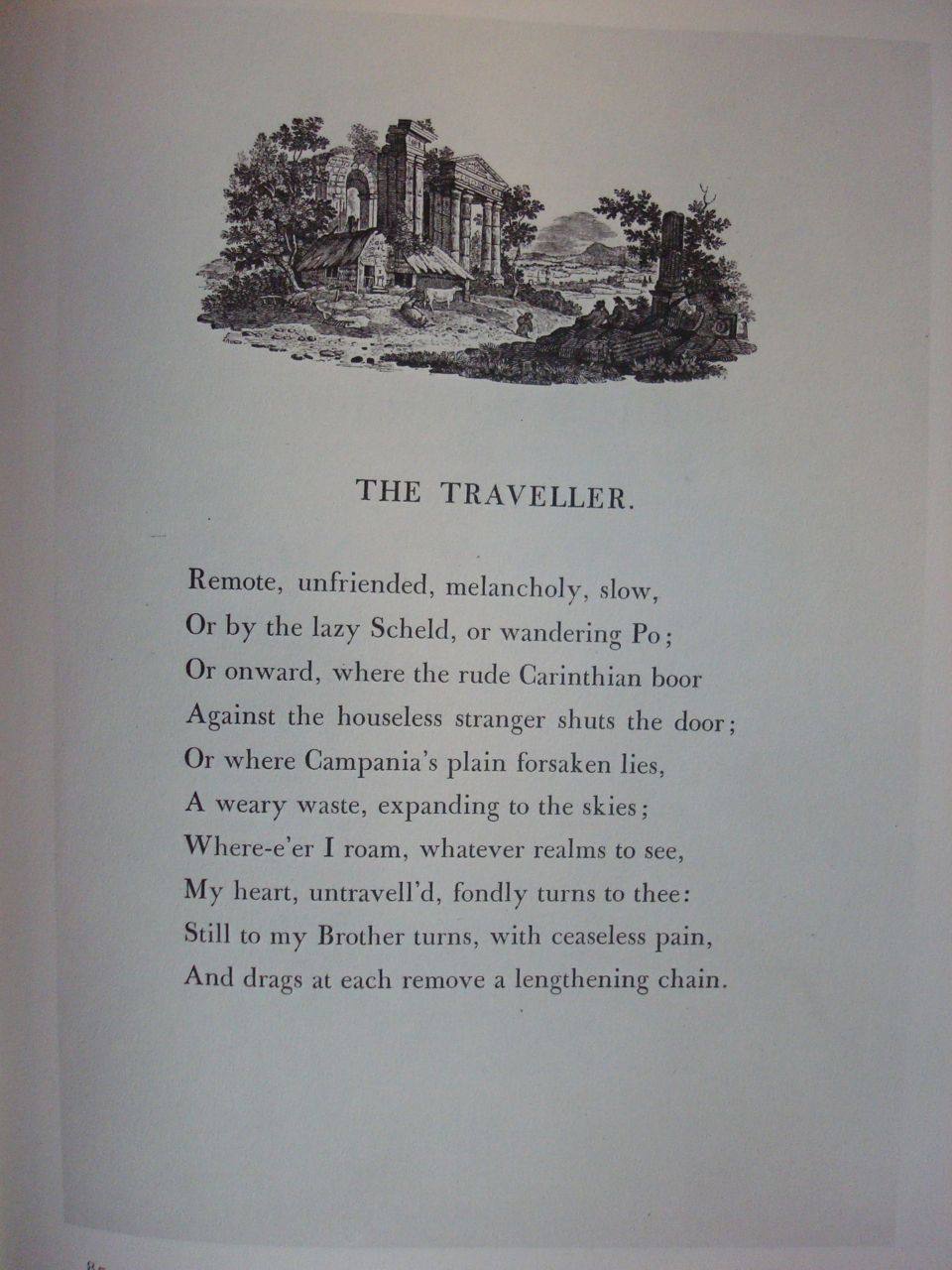
Many of you have seen my Coptic bound sketchbooks online or at workshops. They were the result of a wonderful workshop with Laurie Doctor at Cheerio and the realization that I had a myriad sheets of art papers that I’d accumulated from workshops and random studio projects. I decided to randomly tear those papers down, glue them to boards and include them in signatures created with Bugra, Ingres and Arches Text paper. The art papers became magical inspiration and the resulting Coptic bound books became great places to paint, draw, write and play. Soon I had half a dozen and often I had them with me at meetings and workshops. Continue reading “Coptic Binding update”
Updates coming soon
I know I’ve been absent a bit while we moved to our new home in downtown Indy. I’ll be updating news here in the next day or so and moving into my new studio in July. I had articles published in the last two issues of Bound and Lettered and taught a Coptic Binding mini-class at Cheerio so there will be lots to share. Meanwhile, have a great Memorial Day weekend.
To Share or Not to Share
By now you may have notice the No Pin Zone graphic on my site. It’s recently come to my attention that, unlike Facebook and Twitter, photos and videos captured to Pinterest are full sized images and once pinned become the property of Pinterest:
“By making available any Member Content through the Site, Application or Services, you hereby grant to Cold Brew Labs a worldwide, irrevocable, perpetual, non-exclusive, transferable, royalty-free license, with the right to sublicense, to use, copy, adapt, modify, distribute, license, SELL, transfer, publicly display, publicly perform, transmit, stream, broadcast, access, view, and otherwise exploit such Member Content only on, through or by means of the Site, Application or Services.” (http://pinterest.com/about/terms/)
With that in mind, I’ve decided to create a No Pin Zone here. That doesn’t mean you can’t continue to share links to my website on Facebook and Twitter. In fact, I encourage it. Thanks for understanding and enjoy the art.
Welcome to my new site
Thanks in no small part to the efforts of our wonderful daughter, my website is now here on WordPress. As an artist, I can’t begin to tell you how much I love the new ways I can share my art with you. Look for lots of new photos in the near future and a forthcoming Etsy site. Meanwhile, if this is your first time here or you haven’t visited in while, take some time to browse through the blog and gallery where you’ll find art, studio tips, inspiration and workshop photos. Thanks for visiting and come back soon.
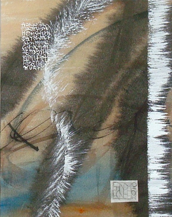
Soft Winds
Sumi ink and watercolor evoke a feeling of soft winds across a sea of azure. The letters are gleaned from the earliest known examples of written Greek discovered in 1900 on Crete by the archeologist Sir Arthur Evans and have been used only for their artistic value without any meaning implied.
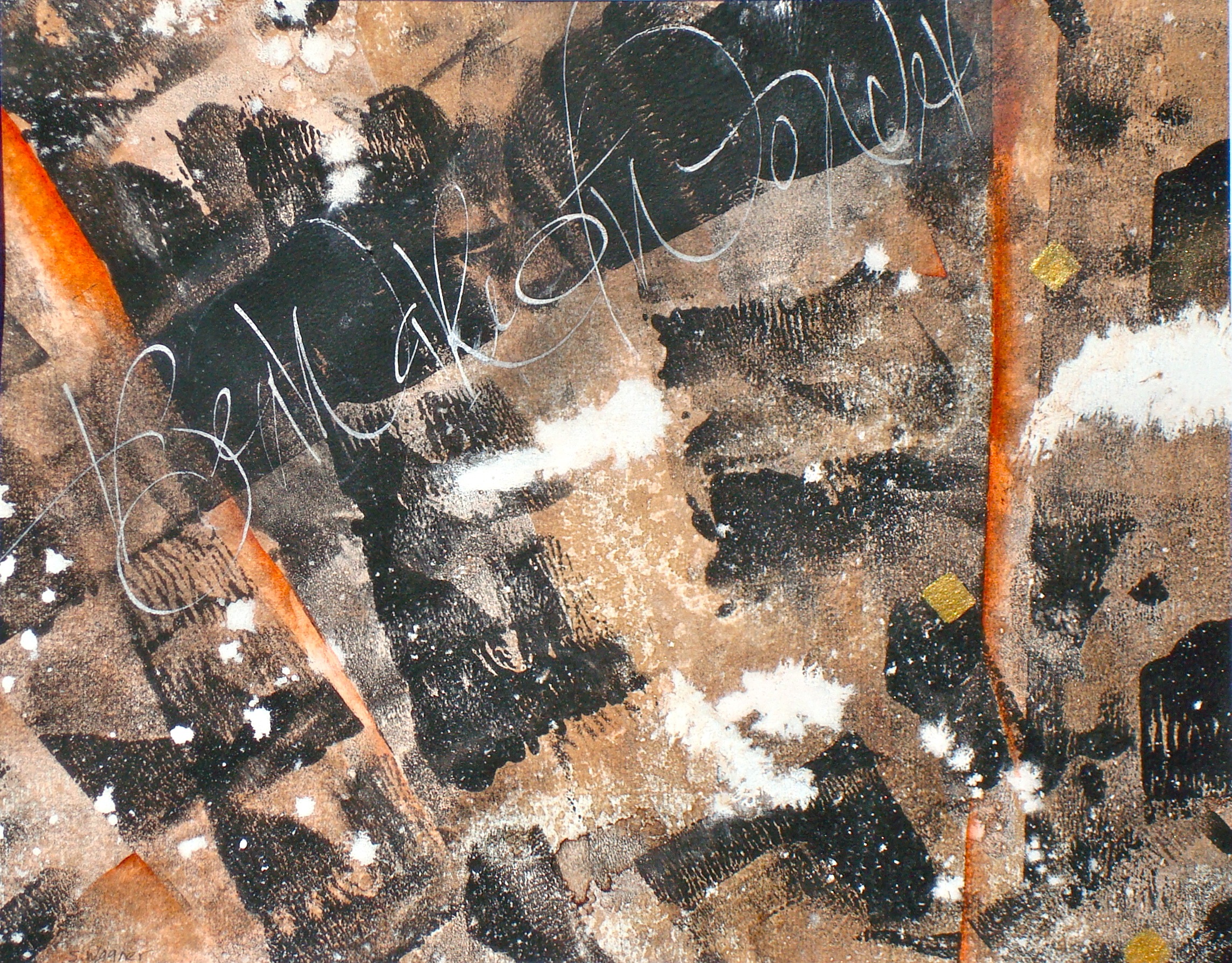
Be Aware of Wonder!
Using wet in wet techniques, Nussbaumbieze (peat ink), Moon Palace sumi, Dr. Martin’s Bleedproof White and Daniel Smith watercolor were painted, rolled or dropped onto Arches Velin paper thereby creating a feeling of joyous chaos and wonder, eventually inspiring the text fragment Be Aware of Wonder to be written gesturally on the final 7.5″ x 9.5″ fragment cut from the original sheet.
Where Is Art?
Selected for the 2010 Letter Arts Review Annual Juried Issue, the text is original and was gesturally written in response to the background created with a pen/ink sgraffito technique and watercolor wash on 8×10 Rives BFK. The French shell gold was added as an accent.
Where is Art?
The art is in the eyes and art
is in the mind.
Open the mind so that your eyes might see what your heart knows!
For therein lies art.
Darkness Into Light
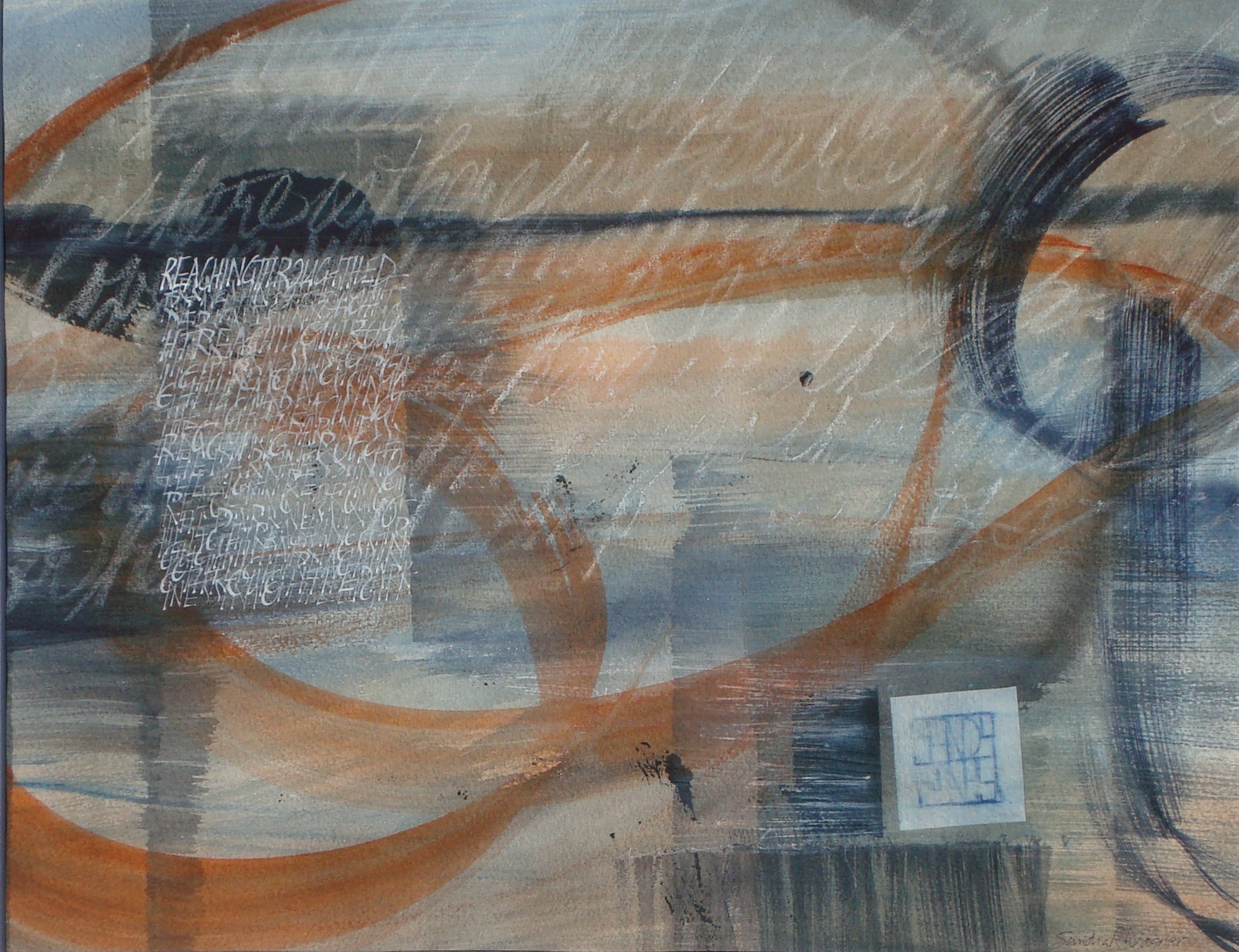
The underlying watercolor wash was created over a blindly written text using a wax pencil resist. A feeling of the illusiveness of creativity lying in wait within the darkness of one’s mind brought to me the following text fragment – Reaching through the darkness to find the light – subsequently layered as a text block using white gouache.
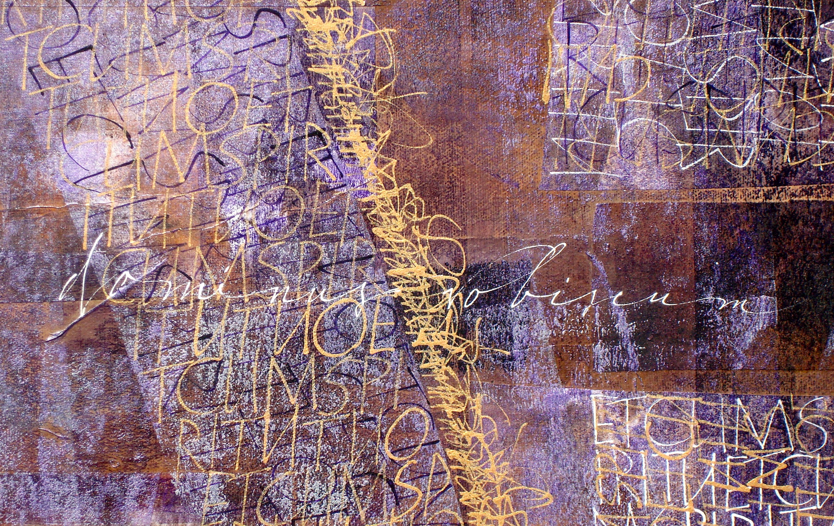
Dominus Vobiscum (detail)
Those Marvelous Margins
 I don’t think one can say this too many times. Margins are important, perhaps the most important part of a work. They are the frame within the frame; a place for the eye to rest while soaking up the artwork or letters contained within.
So why do so many contemporary calligraphers and book artists neglect these wondrous white (or background) spaces?
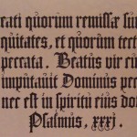
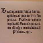 Here are two photos of same blackletter page. One has had the margins cropped off. The original has breathing room. It allows you to appreciate the texture of the lettering, to notice the darks and lights of the majuscules and to focus on whole words and sentences. The other should, even if you’ve never studied layout and design, make you slightly claustrophobic.
Manuscript page design has changed little since the first books were written. Whether you’re looking at a page from the Book of Kells or browsing the Saint Johns Bible Website, you will see margins that enhance the readability and artistic design of the page. Two very fine resources for studying traditional margins are The Calligraphers Handbook, edited by Heather Child (the paperback with the blue cover) and Edward Johnston’s Writing and Illuminating and Lettering.
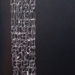
 But what if you’re not designing a page in a book? What about contemporary art, addressing envelopes, or making a broadside? Space still matters.
For more contemporary studies, Sheila Water’s Foundations of Calligraphy and Annie Cicale’s The Art & Craft of Hand Lettering both contain chapters devoted to layout and design.
Studying good calligraphic art is also a very good way to educate your eye. But as you dissect and study letter forms, don’t forget to look for what isn’t there, those magical places above, below, around and between. Margins, interlinear space, anywhere the lettering is NOT is equally as important as the finest letters you can create.


